← Projects / Brand & Environment

7-Eleven

Illustration and environmental graphics developed for 7-Eleven’s first store in India, in Mumbai, including brand walls, retail graphics, and storefront concepts.

7-Eleven
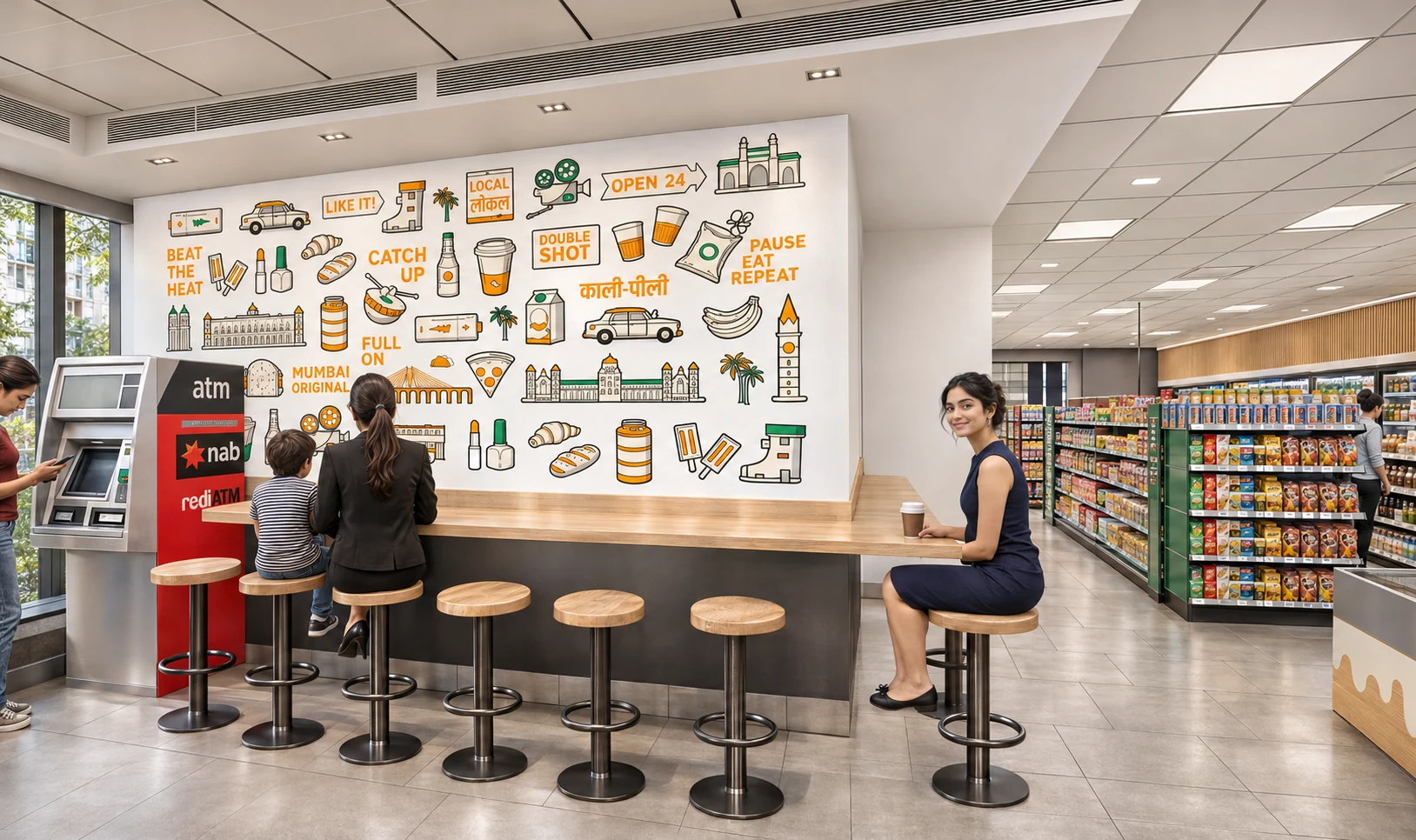
AI-enhanced visualisation of the original store concept, with updated lighting, materials and people.
Inside the project

A global convenience store, speaking the language of Mumbai.

Mumbai context Illustration system Environmental graphics
Type
Professional work · at Idiom
Design contribution
Vasav
Scope
Illustration · Brand wall · Retail graphics · Storefront concepts
Studio
Idiom Design and Consulting
01 / The context

Convenience begins with the city

For India’s first 7-Eleven store in Mumbai, the graphic language needed to connect a global identity with local routines. The original presentation maps three settings: office hubs, transit stops and dense neighbourhoods. Across them, the opportunity is the same—a quick place to pause, pick something up and keep moving. That daily rhythm becomes the organising idea for the work.

Office hubs

Business districts, corporate parks and IT hubs: everyday convenience within the working day.

Transit stops

Metro stations, petrol stations, hospitals and malls: quick stops along an existing journey.

Neighbourhoods

Dense residential areas and markets: a familiar place for the small needs close to home.

02 / Visual direction

A little optimism in the everyday

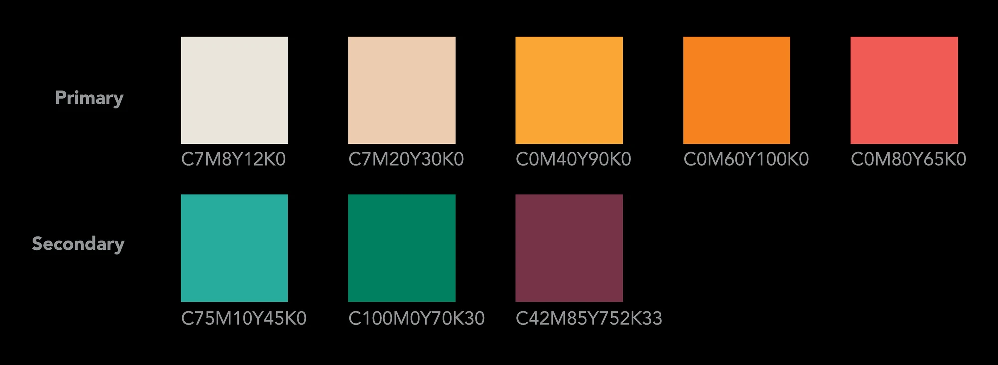
The direction brings food, travel and familiar city references into an upbeat illustration system. Cream gives the drawings room to breathe; orange and coral supply warmth; green connects them to the retail identity. Clear silhouettes and short phrases make the graphics readable both as a large wall and as individual details.

The project palette: warm cream, orange and coral, balanced with green and deep plum.
03 / The illustration family

Refresh. Refill. Ready.

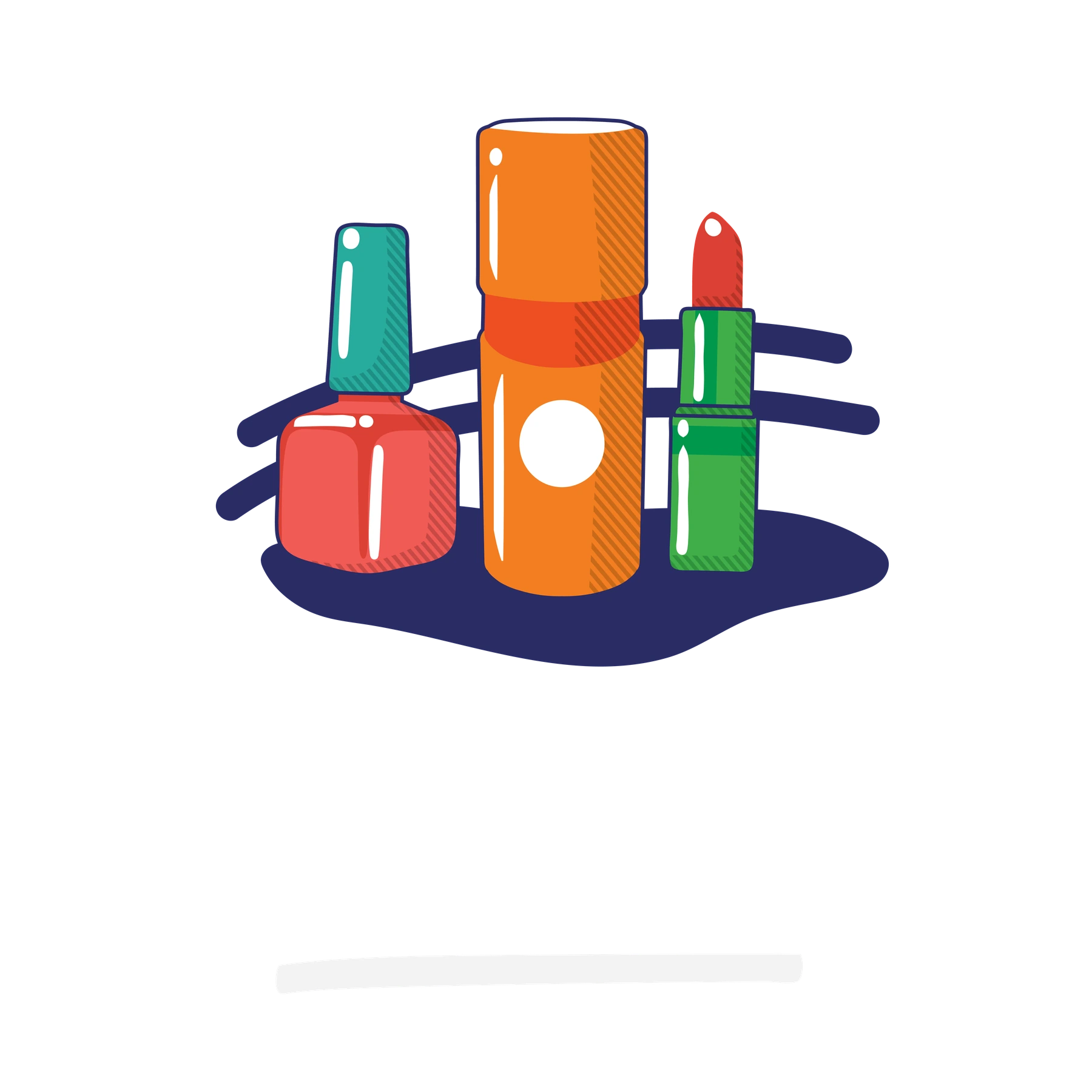
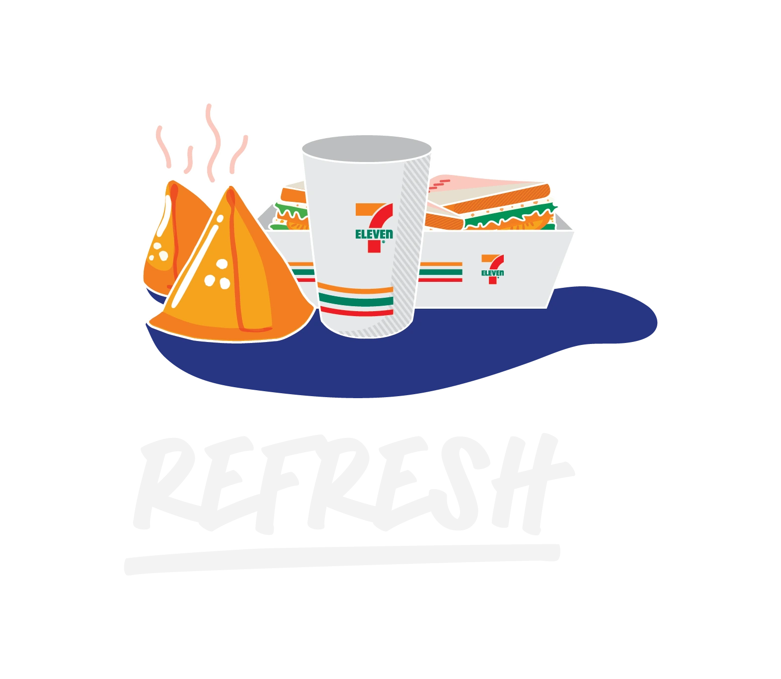
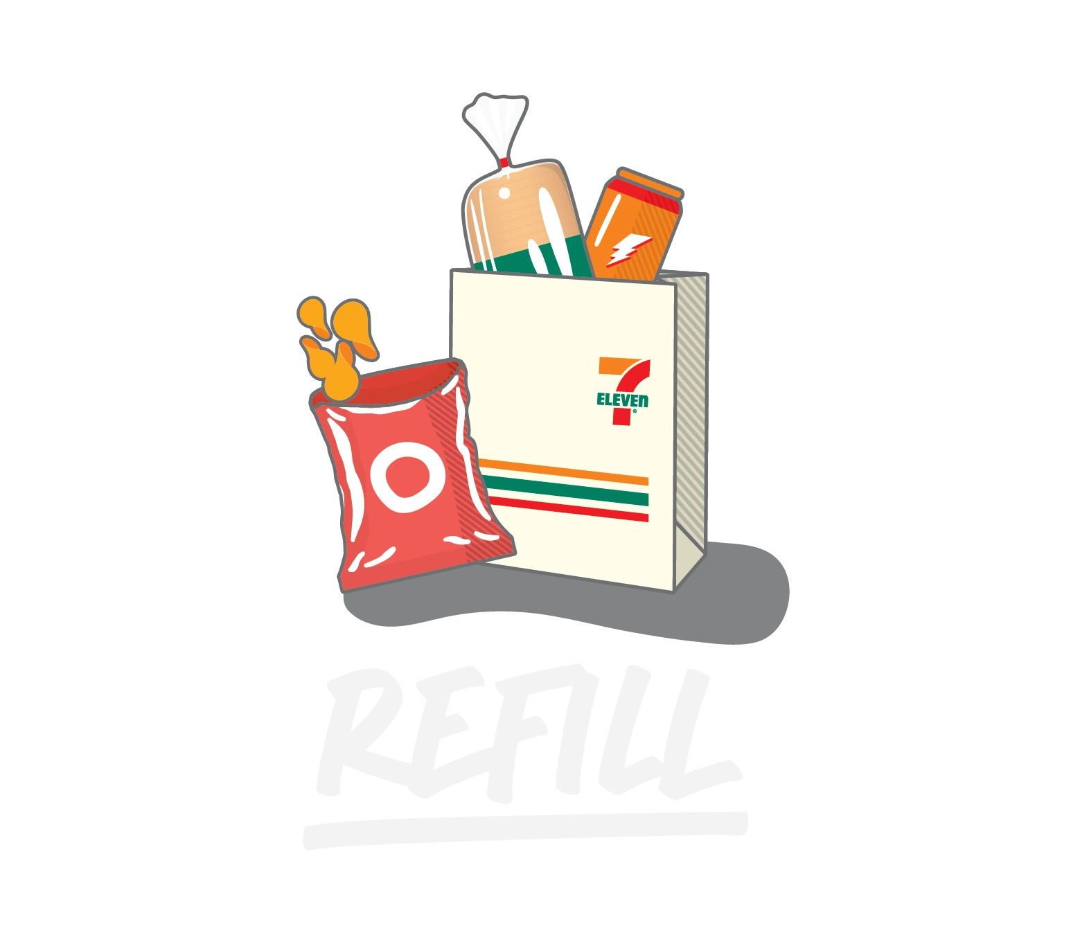
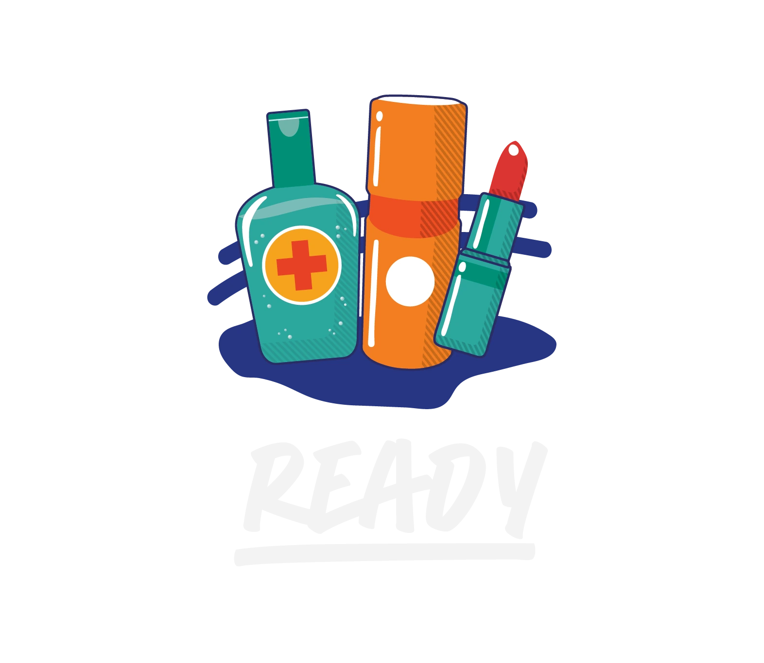
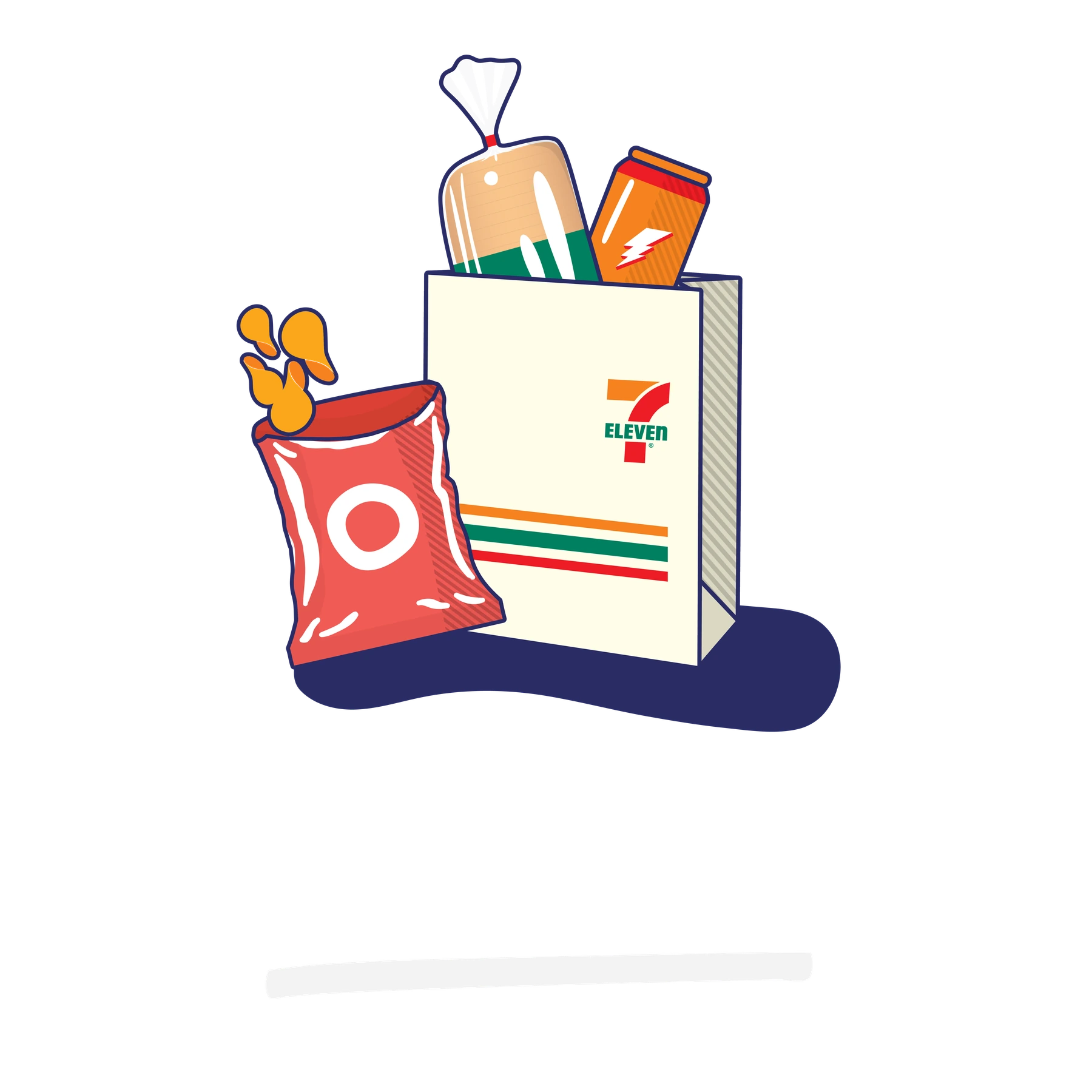
Three groups make a broad product range easy to understand. Refresh gathers food and drink, Refill covers the everyday shopping basket, and Ready focuses on personal care. Shared perspective, bold colour and grounded shadows turn separate objects into one family. The exploration below shows how a simpler grouping developed into the selected food-and-drink composition.
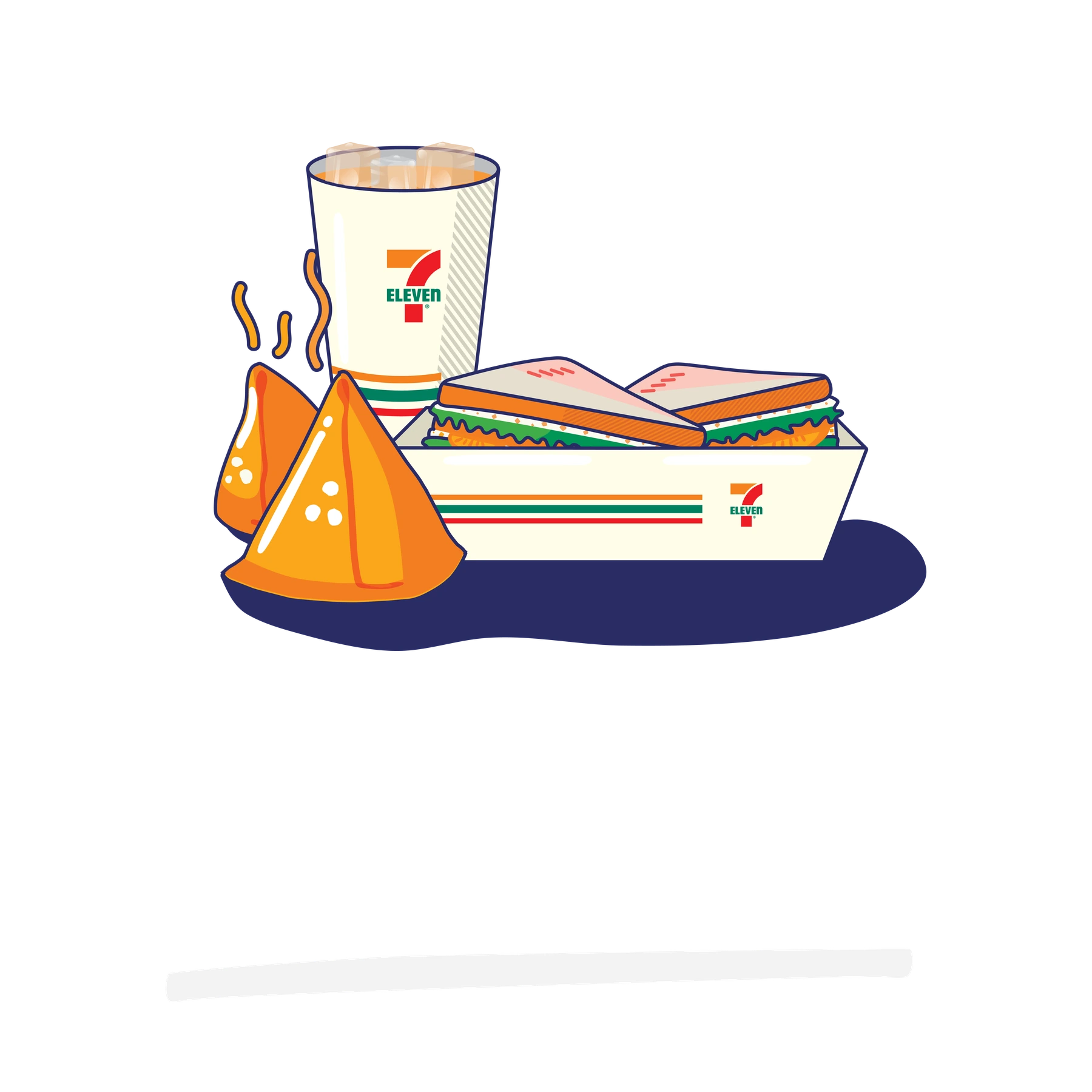
Selected illustration — Refresh: food and drink.
Selected illustration — Refill: shopping essentials.
Selected illustration — Ready: personal-care essentials.
Refresh exploration: a simpler product grouping tested before the selected direction.
Refill exploration: the shopping bag and daily essentials tested as a compact group.
Ready exploration: personal-care products arranged as one recognisable silhouette.
04 / From exploration to application

A whole day, drawn into a clock

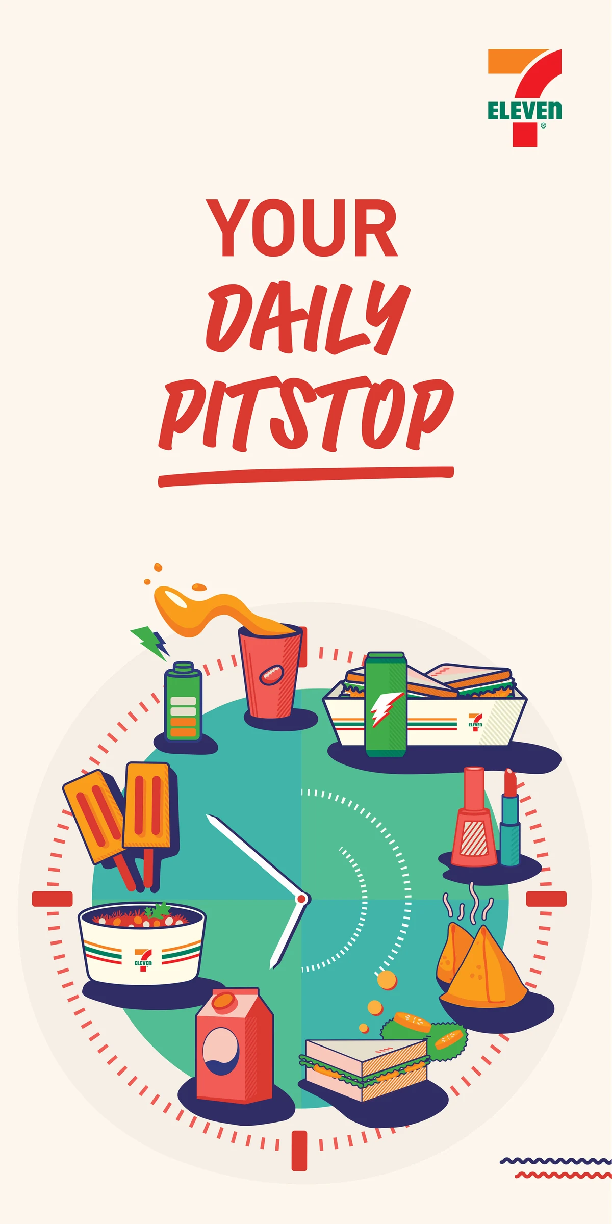
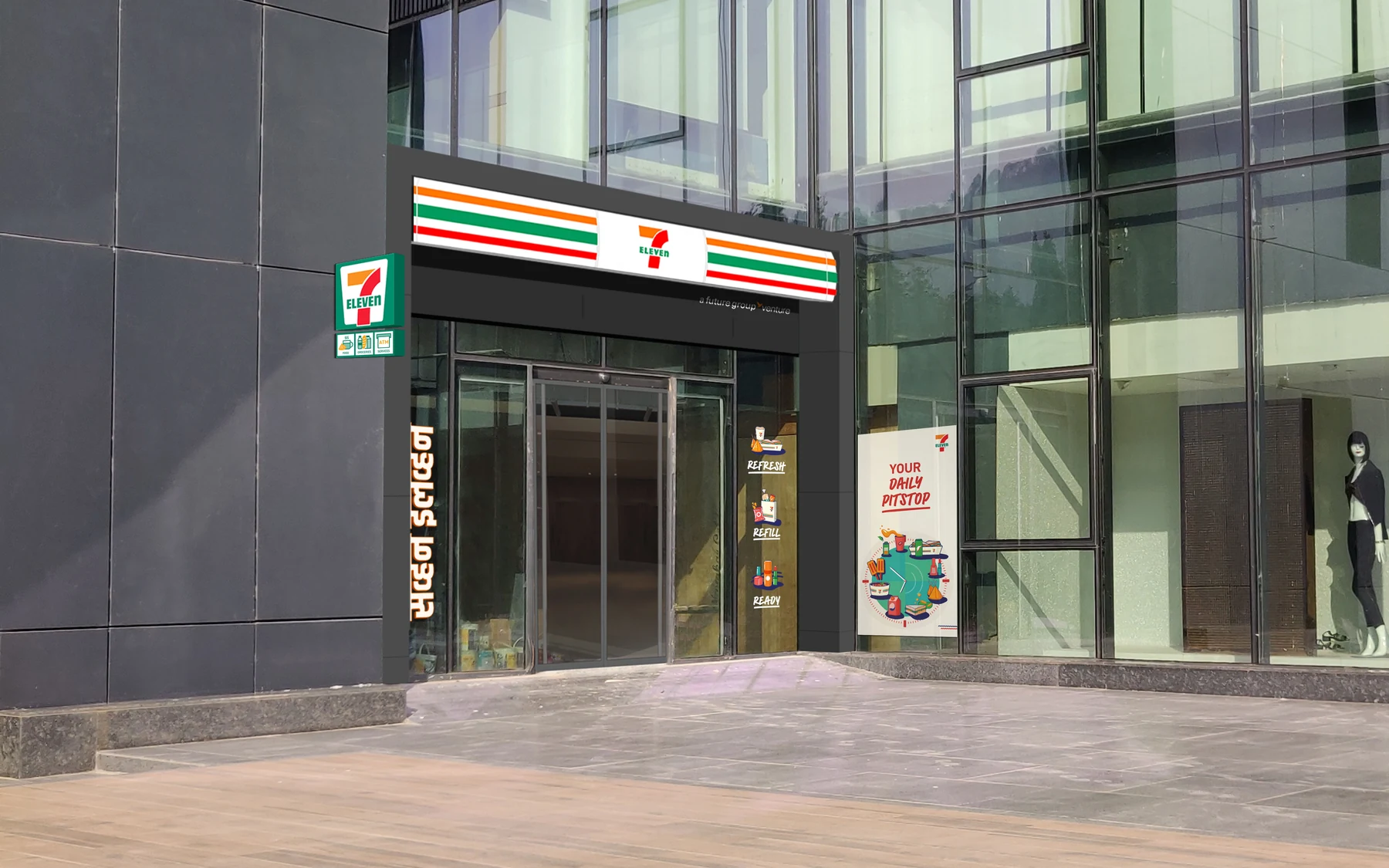
The clock turns round-the-clock convenience into a single image. Food, drinks and essentials gather around its face, making the store’s offer visible from the street. The development moves through green and orange directions before the selected composition is applied beside an entrance.
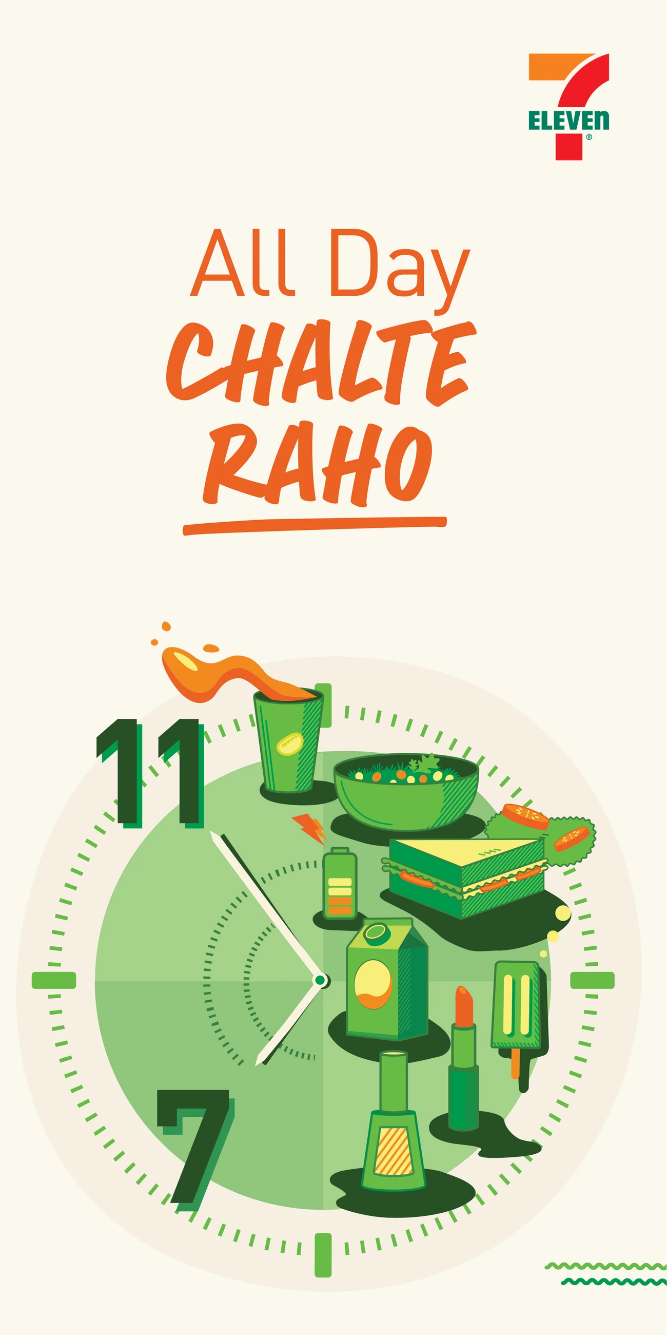
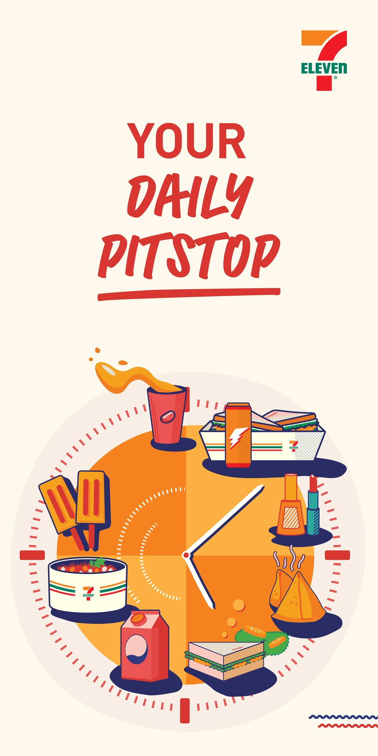
Earlier clock exploration: everyday products arranged around a green dial.
A later orange clock direction brings the product illustrations into a single circular composition.
Your Daily Pitstop: an illustrated clock and retail-signage study.
Storefront concept mockup showing the clock graphic beside the entrance.
05 / The brand wall

Mumbai, one detail at a time

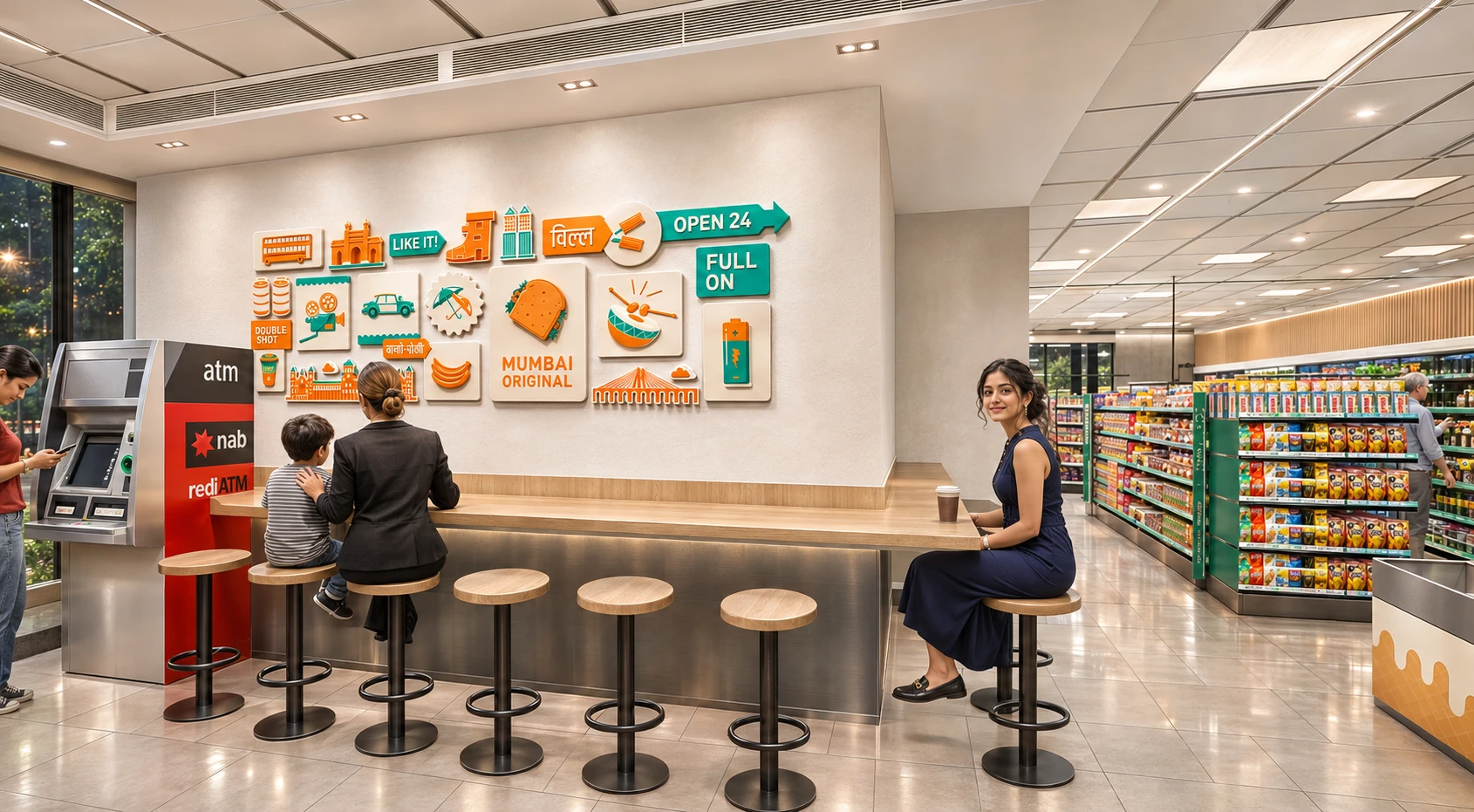
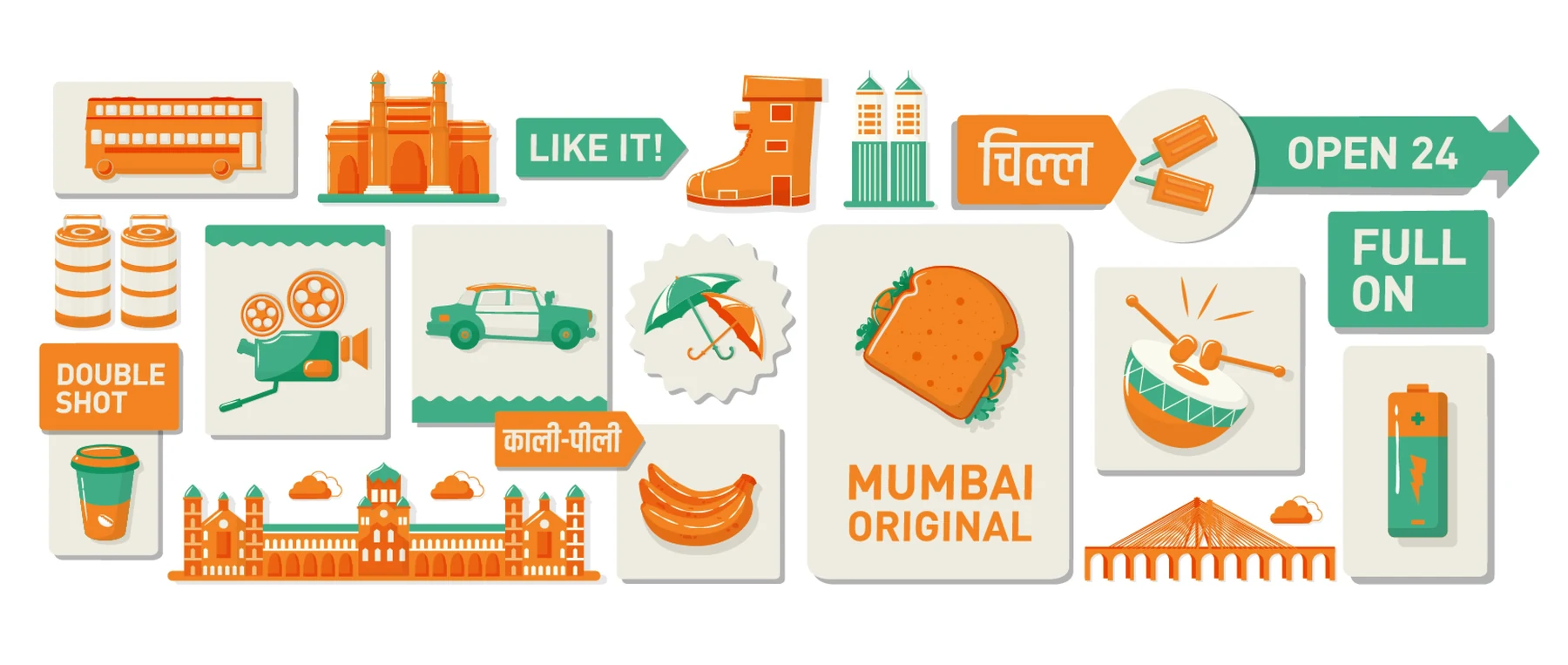
Taxis, local trains, landmarks, food and small everyday rituals build a wallpaper of life on the go. Two directions explore the same story: one uses a loose field of outlined objects; the other groups them into larger blocks of colour. The enhanced retail visualisations show how each direction reads above the seating counter.
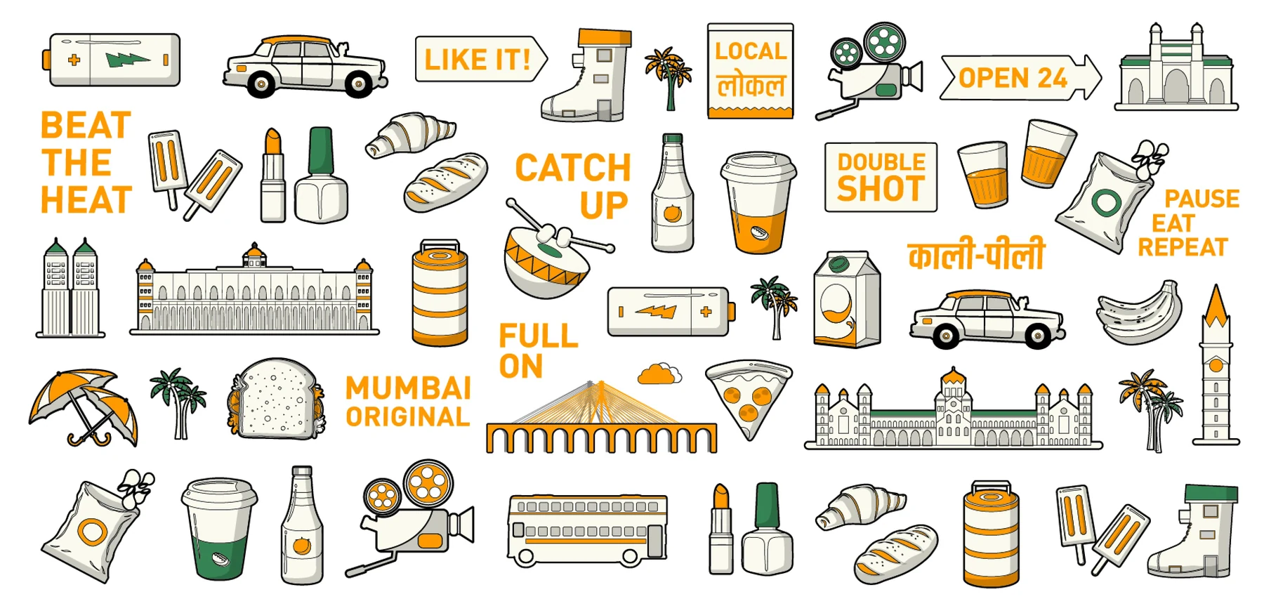
Brand-wall direction with Mumbai references, everyday objects, and short phrases.
AI-enhanced visualisation of the original store concept, with updated lighting, materials and people.
Alternate brand-wall direction using stronger colour blocks.
The orange-and-teal brand wall above the seating counter. AI-enhanced visualisation with updated lighting, materials and people.
06 / Visualisation update

Seeing the space in a new light

The two wall directions come to life through enhanced visualisations: soft indirect light, tactile timber and tile, and natural human detail give each graphic system a sense of scale and atmosphere. These AI-enhanced views interpret the store concept; the original wall artwork is shown alongside them in the preceding chapter.
Continue exploring

JALAJ

The sacred meets the digital.