← Projects / Brand & Digital Design

LivQuik

Logo, brand guidelines, business stationery, and website design for LivQuik.
LivQuik
Inside the project

A recognisable identity, from a single Q to a digital experience.

Symbol & wordmark Brand guidelines Digital applications
Type
Professional work · at Idiom
Design contribution
Vasav
Scope
Logo · Guidelines · Business set · Website design
Studio
Idiom Design and Consulting
01 / The central idea

Begin with a useful symbol

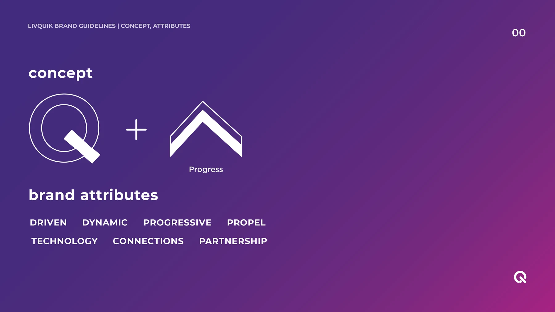
The identity combines the letter Q with an upward, forward-moving form. Early sketches test how those two ideas can occupy one shape; the concept diagram makes the relationship explicit. The resulting symbol can work inside the wordmark or on its own when space is limited.
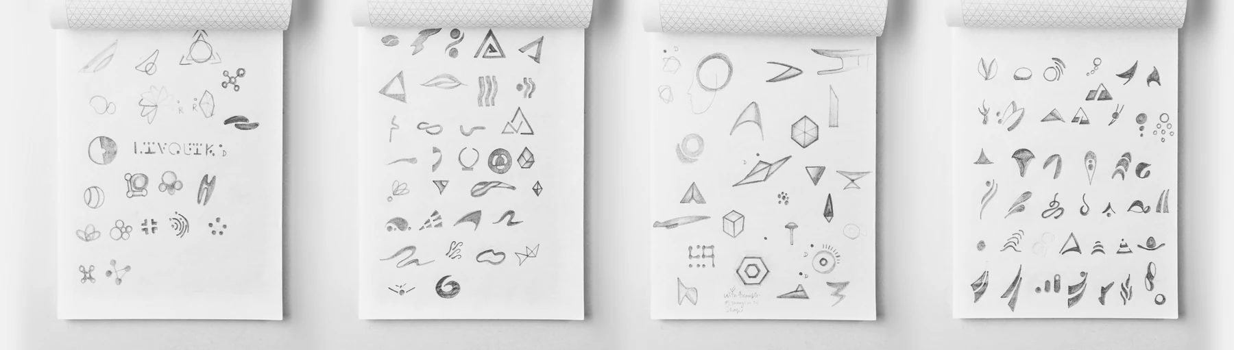
Early LivQuik logo sketches and form exploration.
Brand-guideline concept: the letter Q combined with a progress symbol.
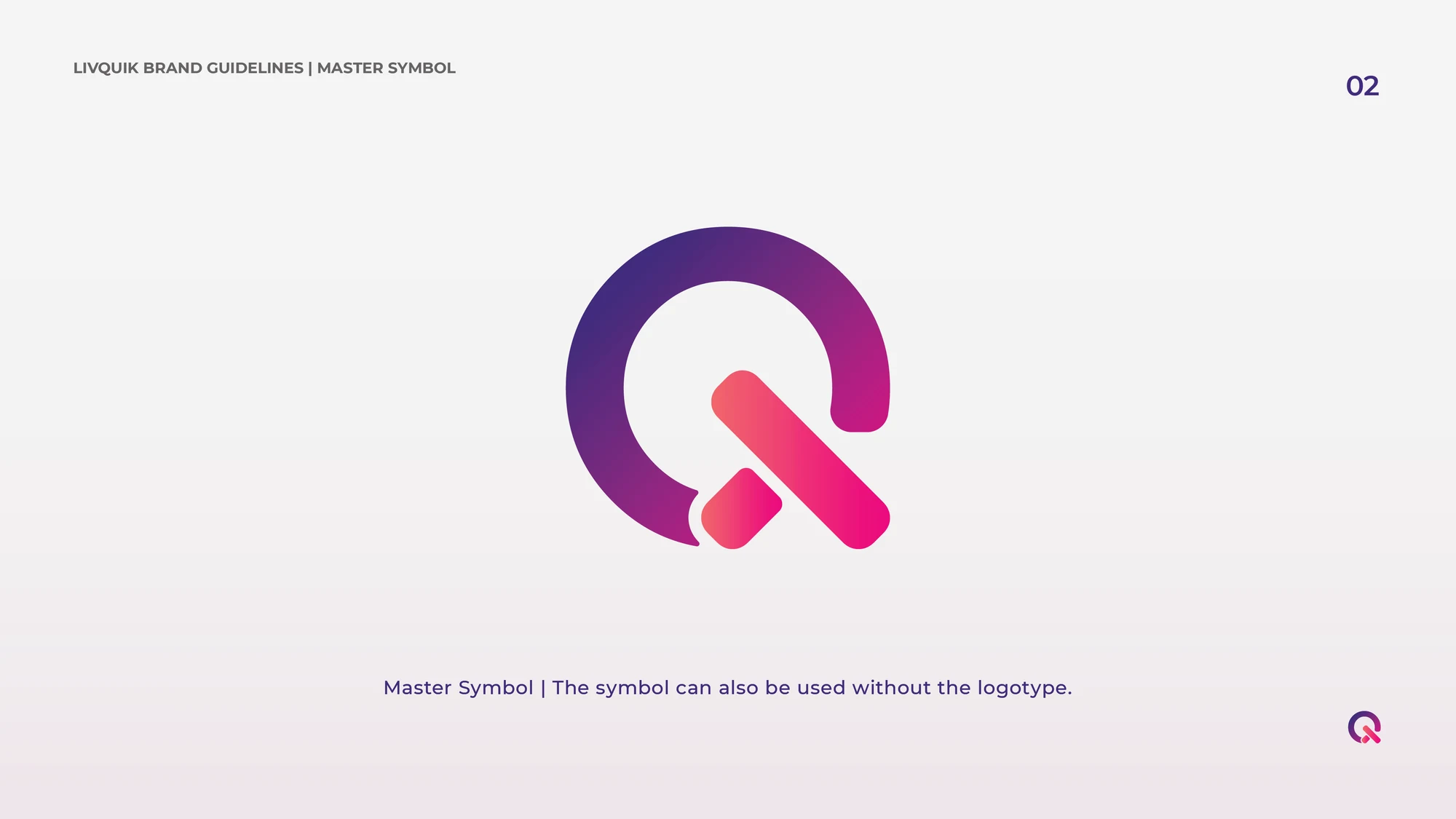
The standalone Q symbol, developed for use beyond the full wordmark.
02 / Visual language

Finding the right energy

Colour variants explore several directions before the purple, pink and warm-gradient system is established. The palette gives the identity energy, while the type system keeps business and digital communication clear. Showing the alternatives alongside the developed language makes the design decisions visible.
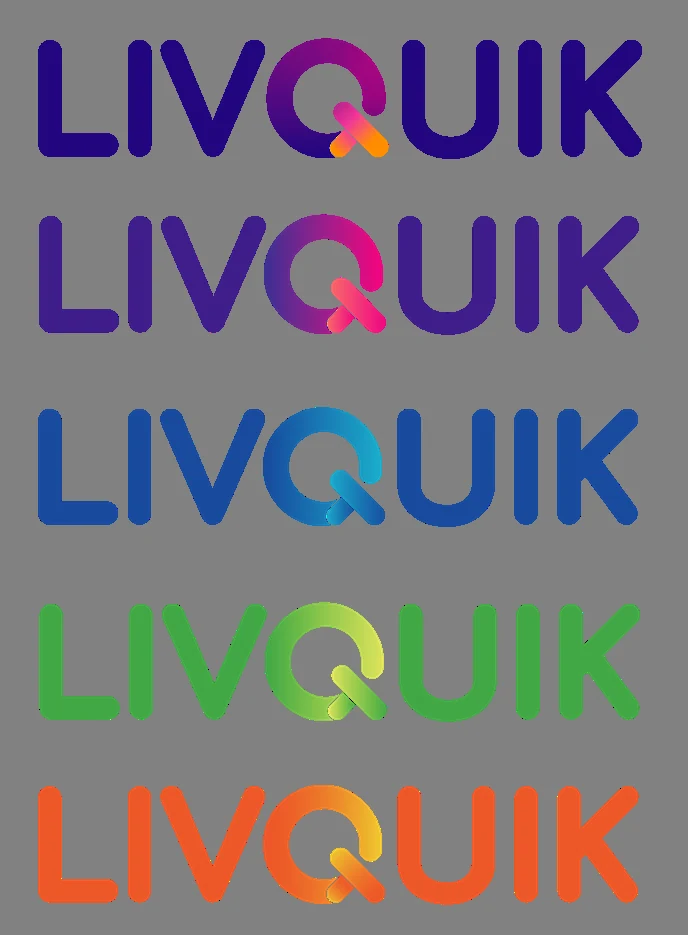
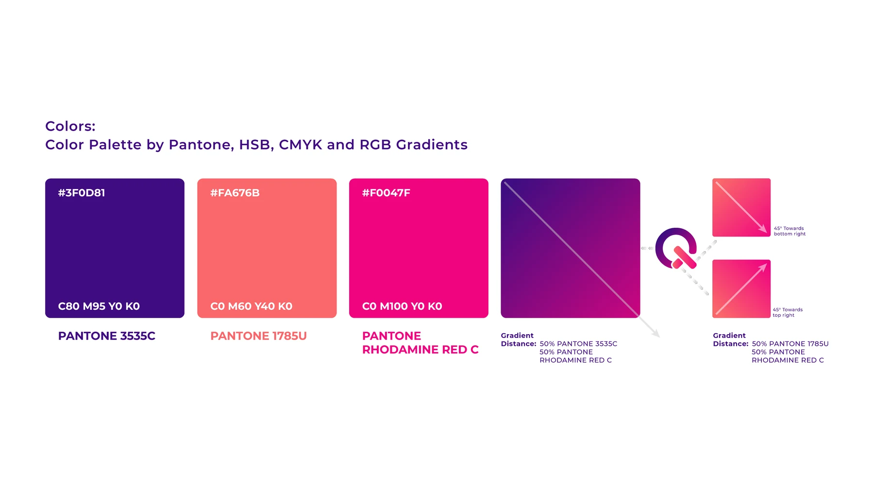
Colour explorations test the identity before the purple and pink system is resolved.
The LivQuik colour system and gradient applications.
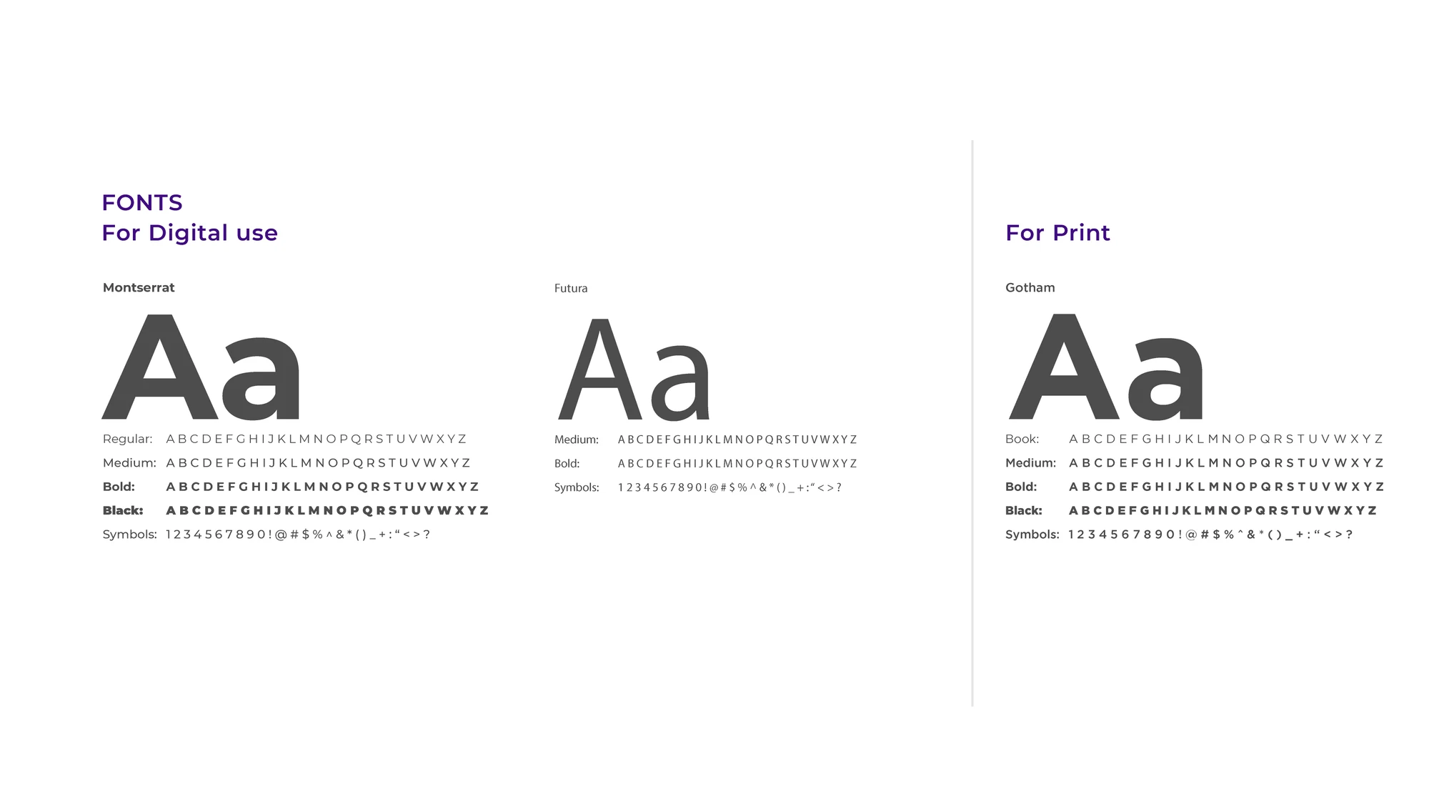
Type specimens define the visual relationship between print and digital communication.
03 / Rules for everyday use

Make consistency easy to repeat

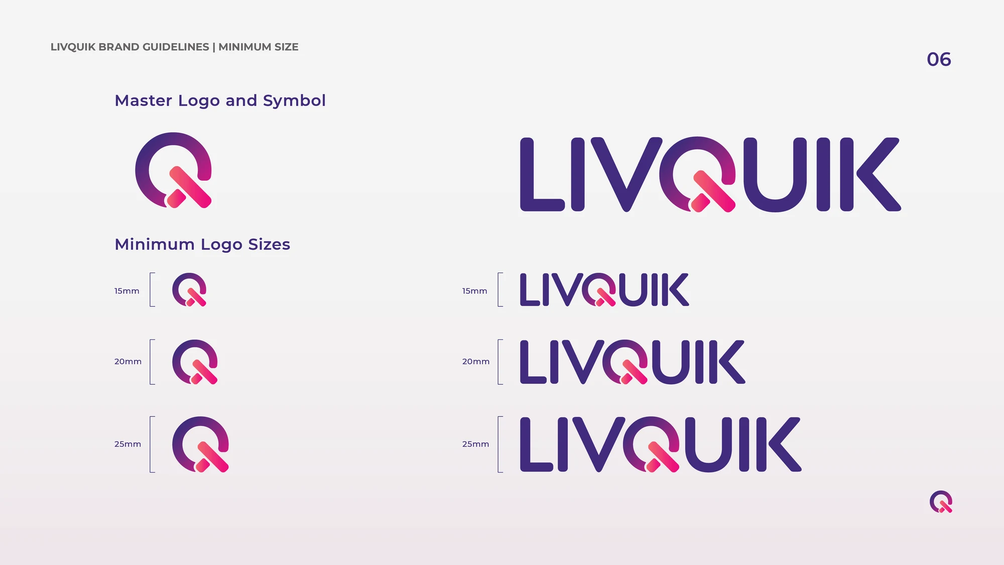
The guidelines turn a logo into a system other people can apply. Clear space protects the mark; monochrome versions handle restricted reproduction; minimum-size examples preserve legibility. Correct and incorrect applications show where the identity can flex and where its structure needs to remain intact.
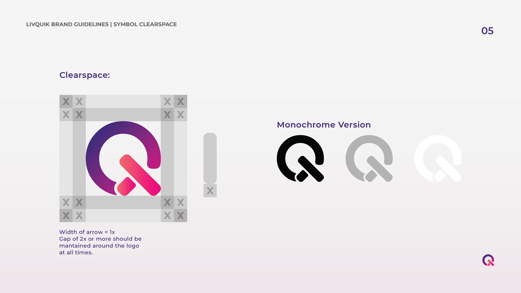
Clear space and monochrome versions keep the identity usable across different backgrounds.
Minimum-size and scale guidance for the symbol and wordmark.
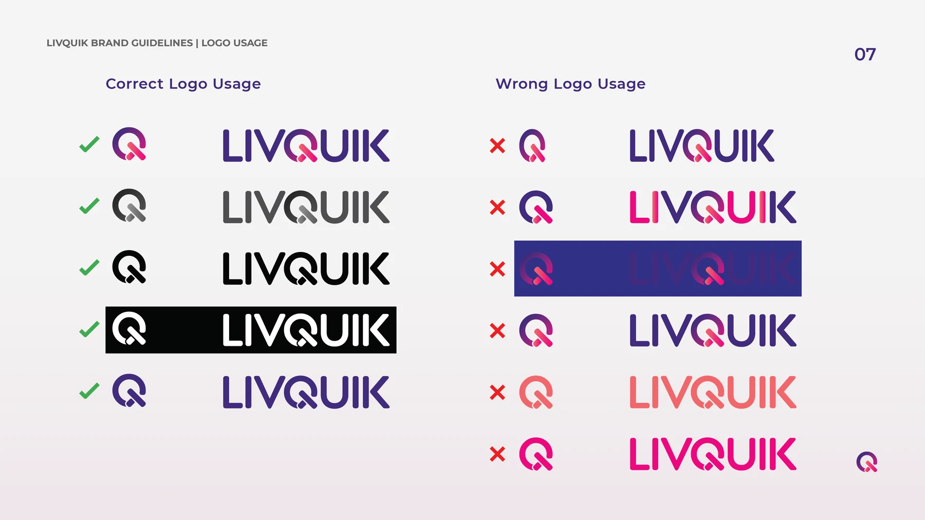
Brand guidelines showing correct and incorrect logo applications.
04 / Icons & applications

Small details, one family

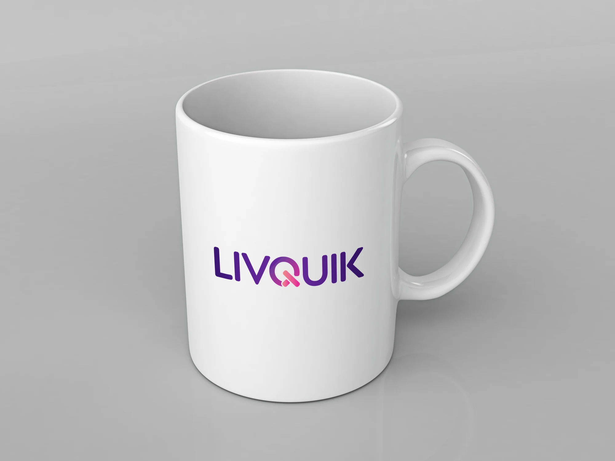
The outline icons give services and use cases a shared visual vocabulary. Their consistent weight and simplified forms keep them readable at small sizes. An everyday brand application shows the wordmark at a different scale, extending the same identity beyond a guideline page.
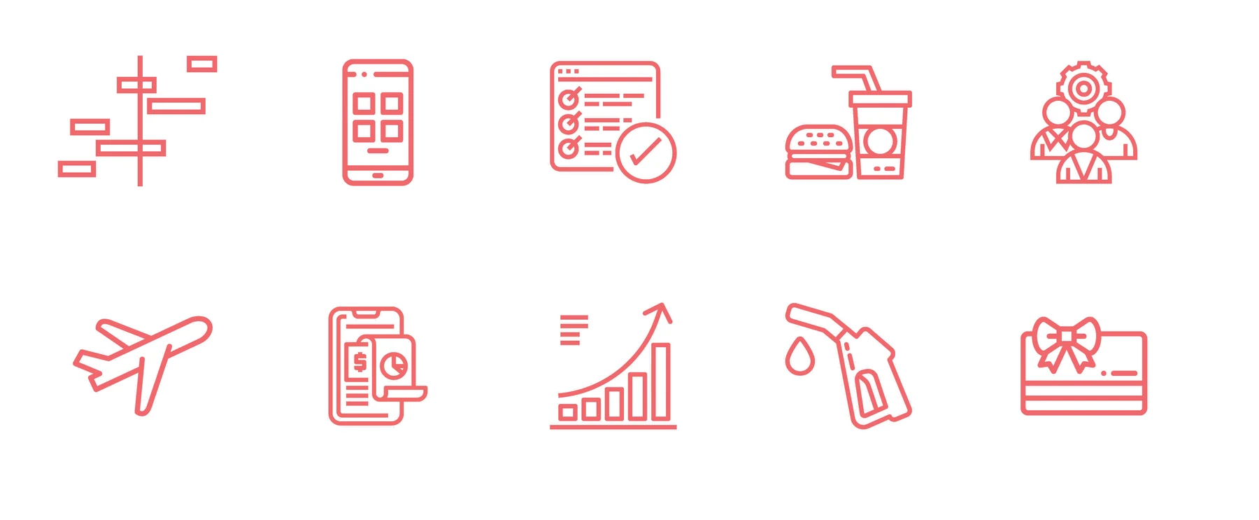
Outline icon family for digital and business applications.
The developed LivQuik wordmark applied to an everyday object. Brand application mockup.
05 / Stationery & business set

An identity for everyday exchanges

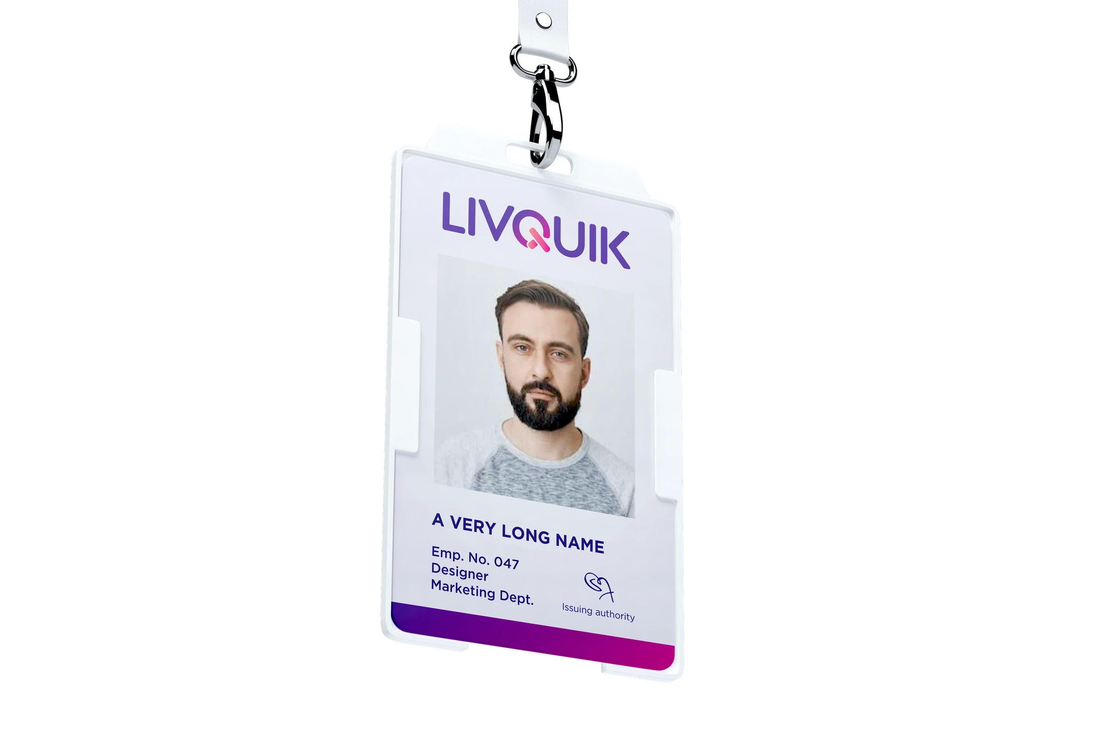
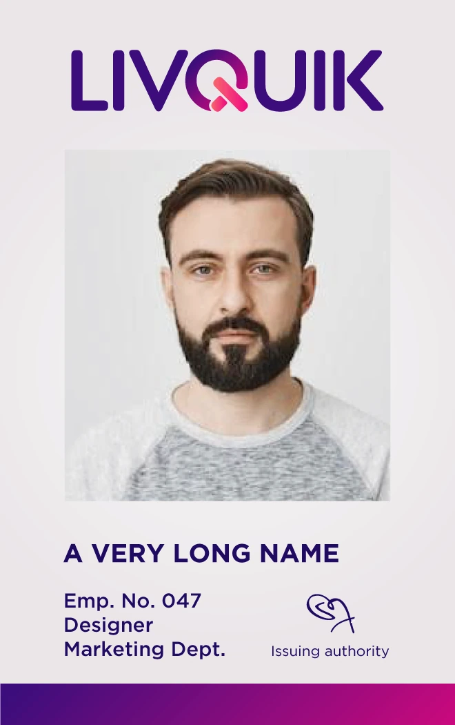
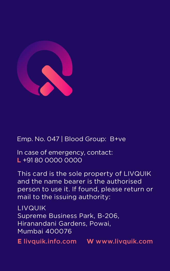
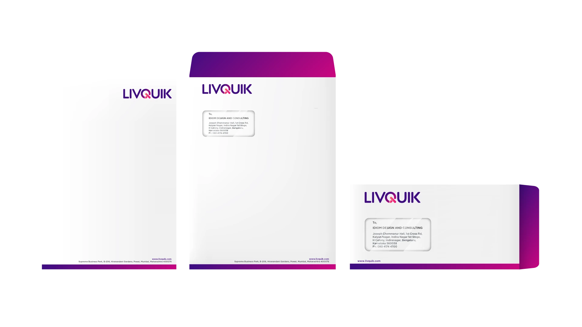
The business set carries the identity into correspondence and face-to-face introductions. Letterheads and envelopes use generous white space with a gradient edge; business cards balance the full wordmark with the standalone Q. ID-card studies extend the same hierarchy and colour system to staff identification. The two stationery colourways show how the system adapts while remaining recognisable.
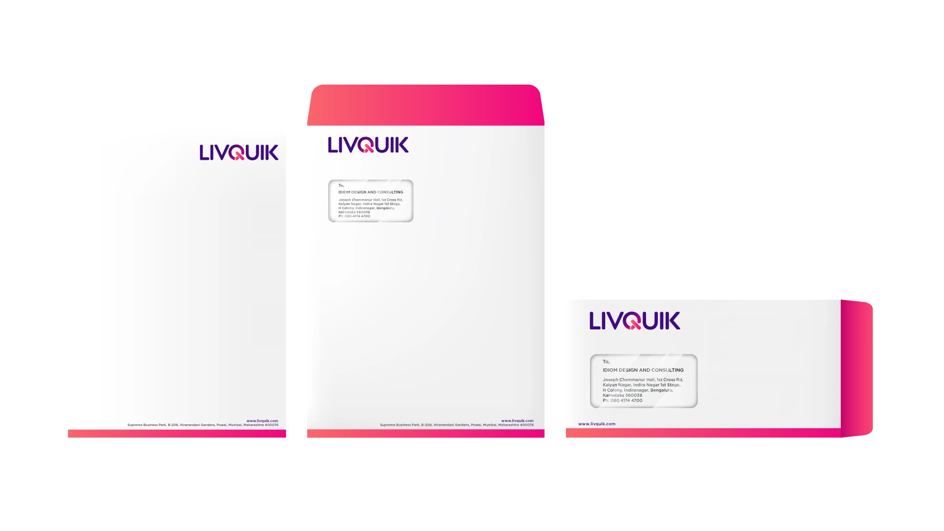
Letterhead and envelope set in the coral-to-pink colourway.
Letterhead and envelope set in the purple-to-magenta colourway.
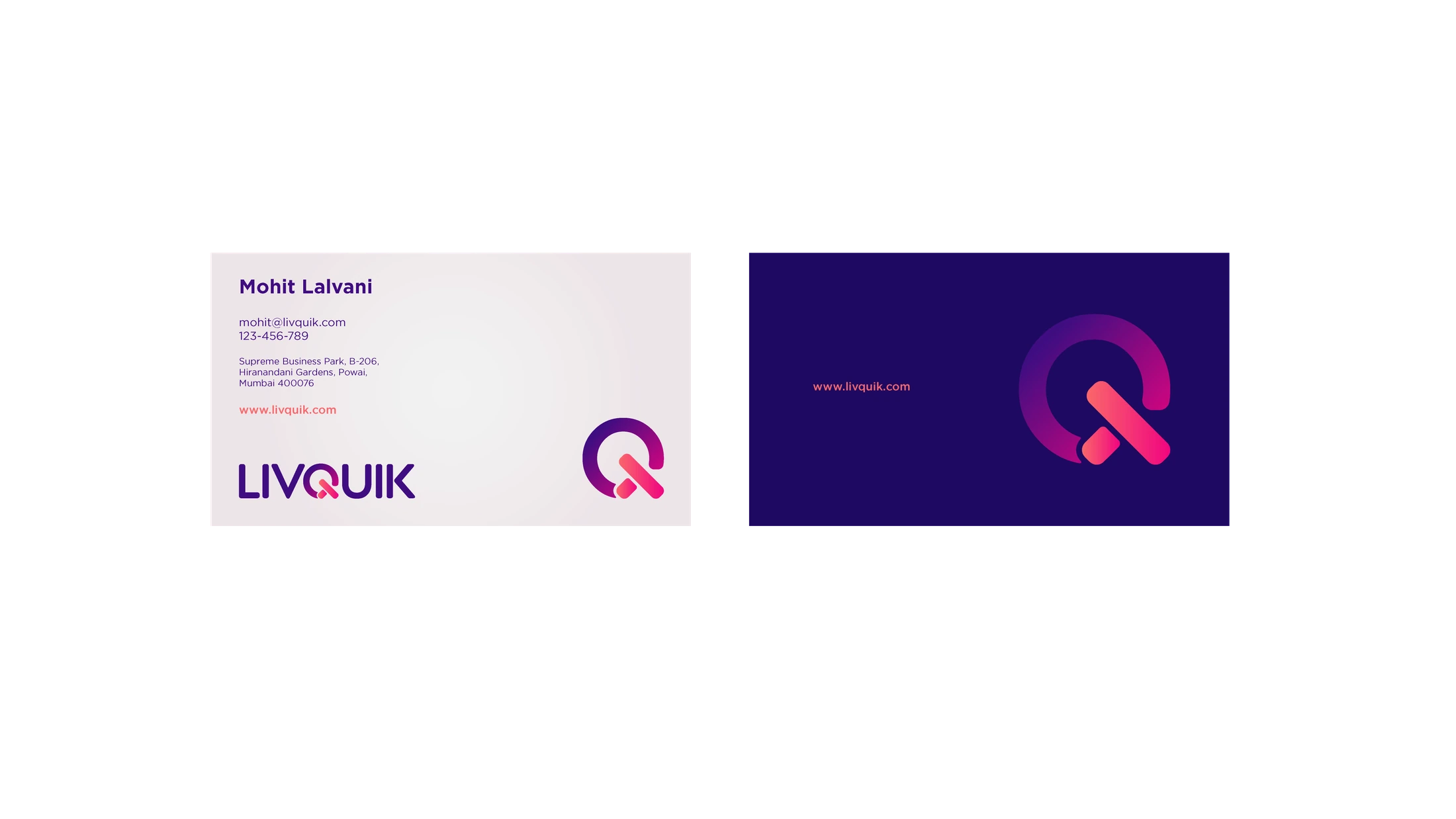
Business card front and reverse, pairing the wordmark with the standalone Q symbol. Original layout study.
Lanyard and ID-card application mockup, using sample portrait and placeholder details.
ID-card front: wordmark, portrait and role hierarchy. Sample portrait and placeholder details.
ID-card reverse: the standalone symbol and information layout. Placeholder details retained from the design study.
06 / Digital applications

From identity to interface

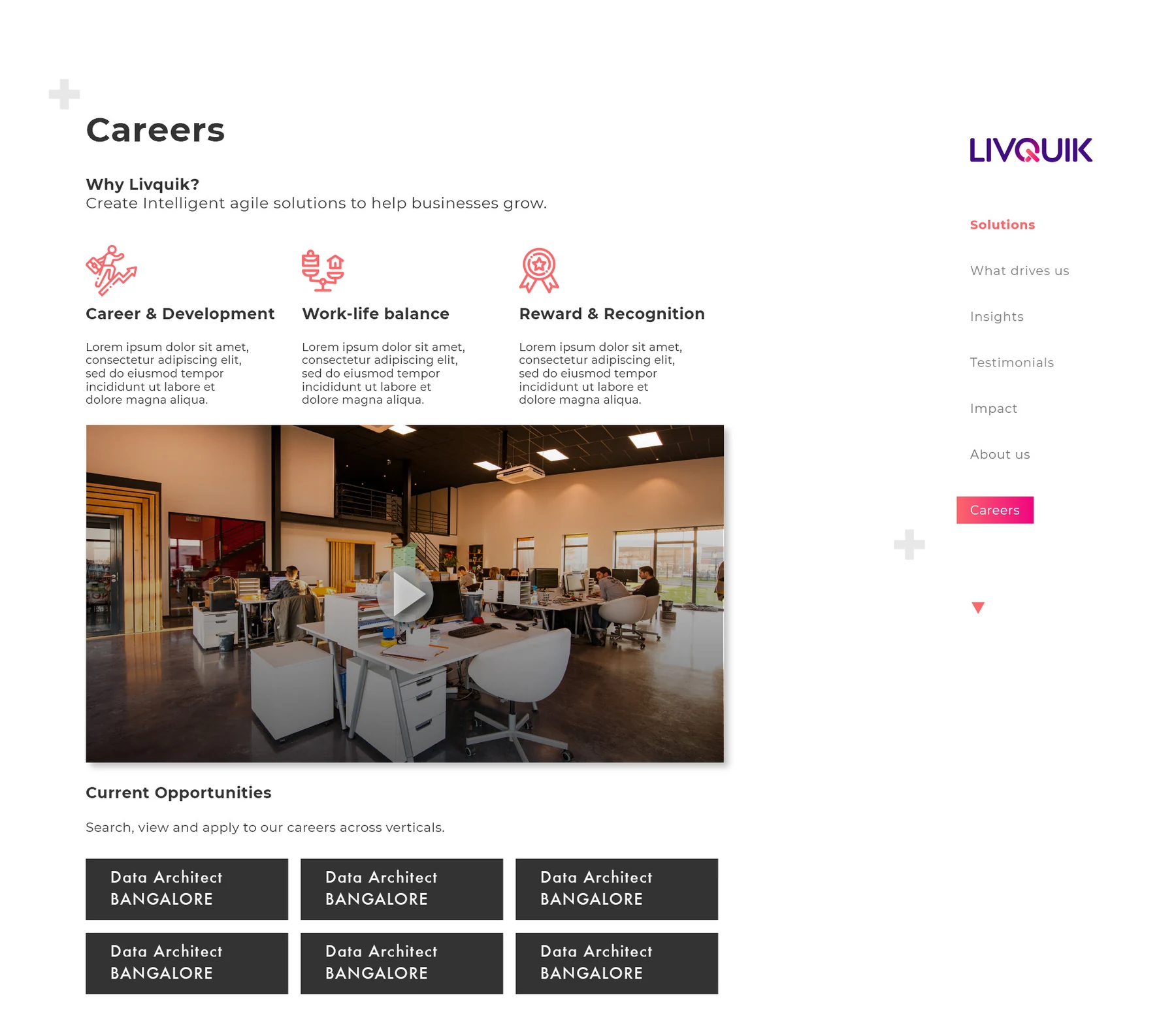
Website studies apply the brand through open space, clear headings and controlled colour. The earlier website mockup uses a standalone symbol direction; the careers layout shows the developed wordmark. These are separate stages of the design process, with placeholder copy retained in the layout study.
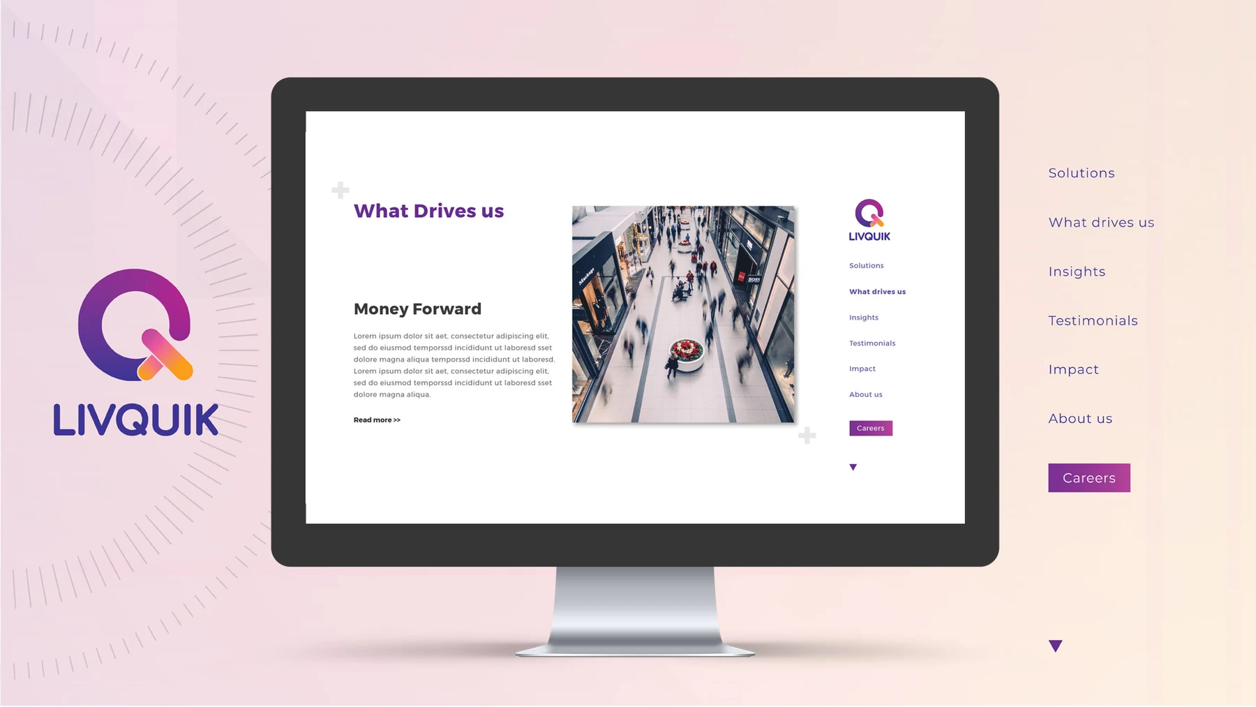
Earlier identity exploration shown in a website mockup.
Careers-page layout study using the developed LivQuik wordmark, with placeholder copy.

Continue exploring

7-Eleven

India’s first 7-Eleven. A Mumbai story.