Discover the place
Property imagery and the surrounding landscape establish a sense of arrival.
A hospitality brand built around motorcycle culture. Website design, character illustration, guest print and merchandise connect the first online visit to the experience of staying at the inn.
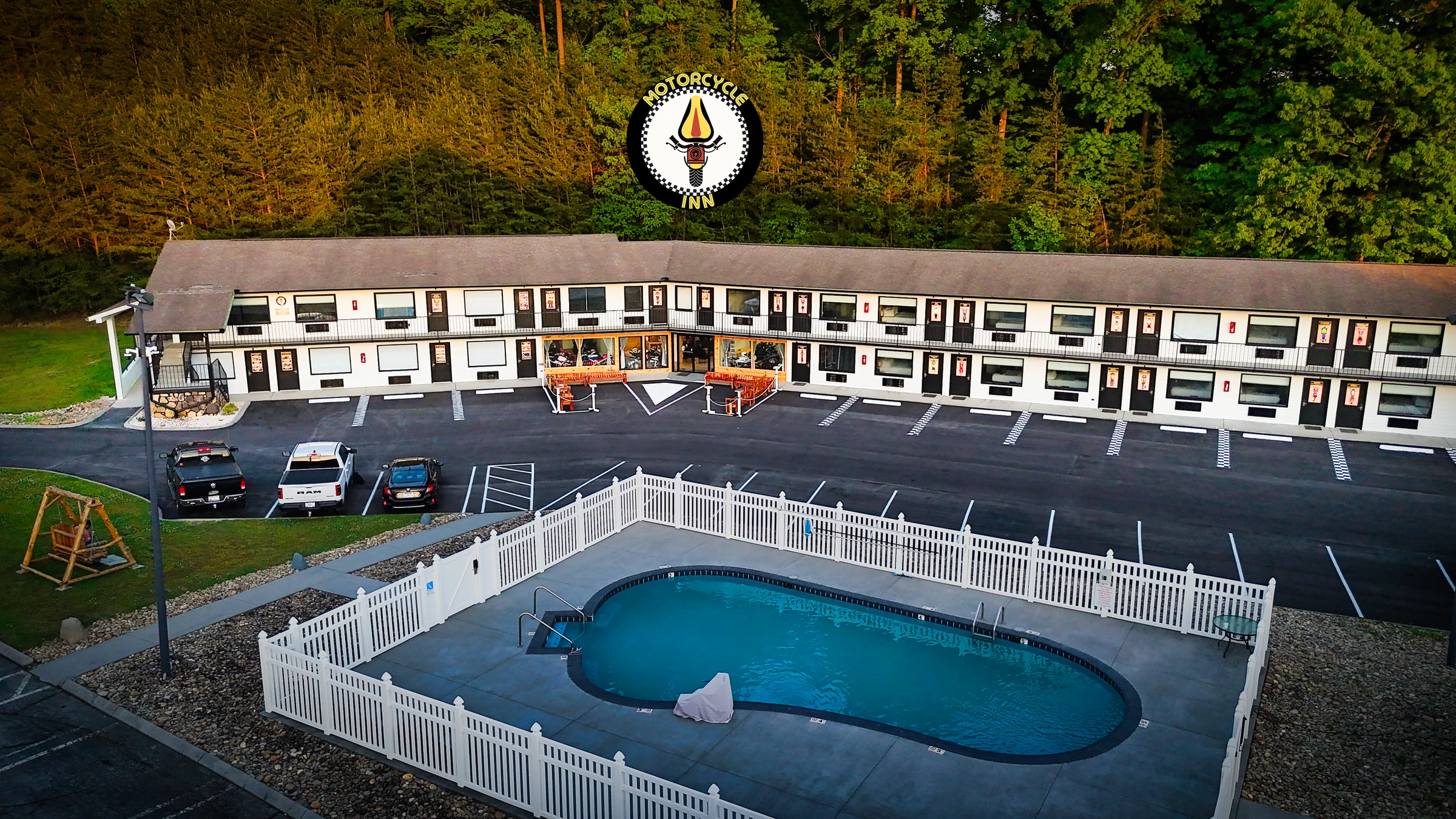
Motorcycle Inn is a motorcycle-themed stay in Kodak, Tennessee, near the Smoky Mountains. Its appeal lives in the details: the bikes, the rooms, the roads and the people who ride them. The design challenge was to give that character a clear, recognisable presence across a website and a varied collection of physical touchpoints. The badge provides the anchor; checkered patterns, warm yellow and motorcycle imagery give the wider system its vocabulary.

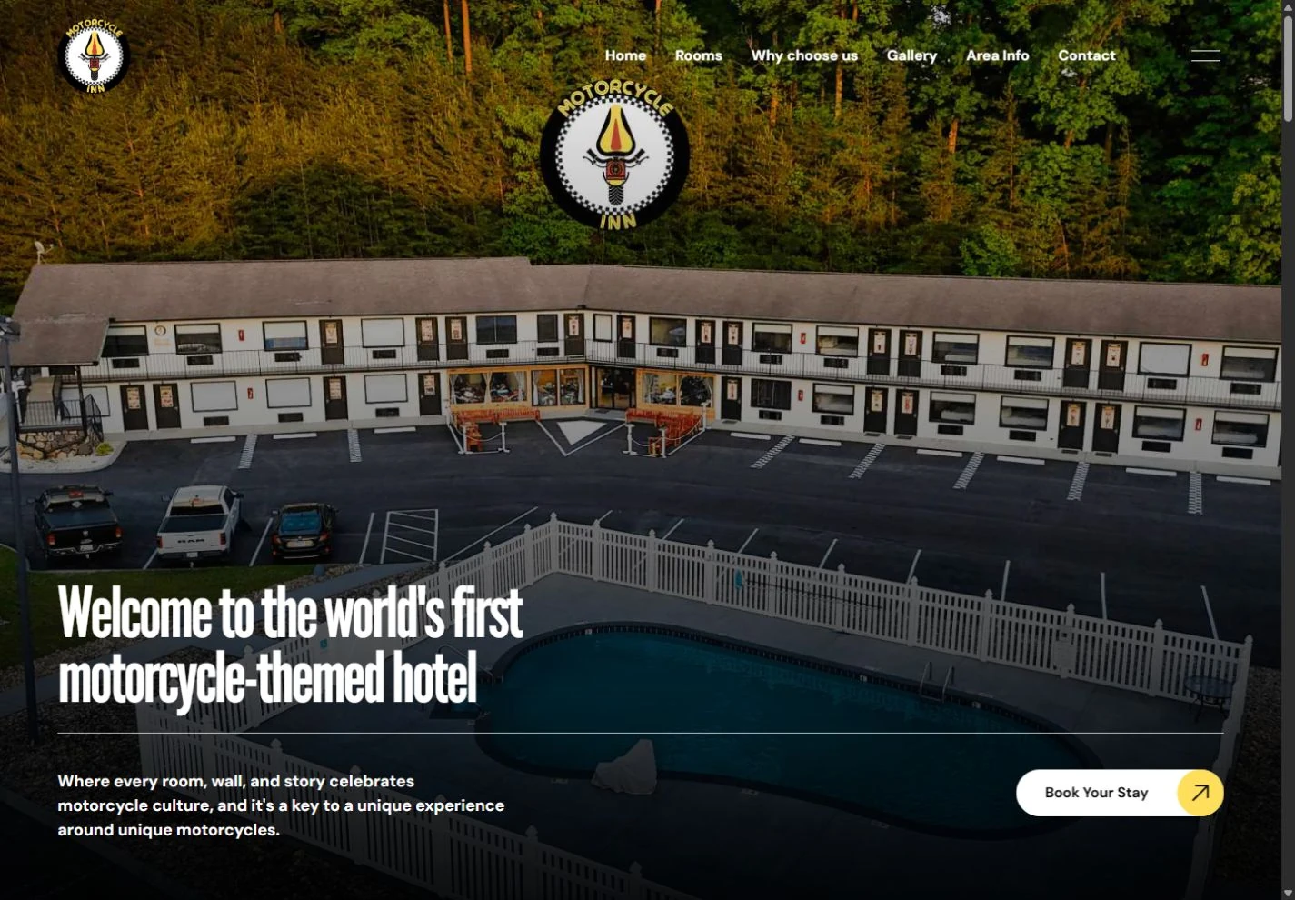
We designed the current live Motorcycle Inn website as an introduction to the destination and a way into its rooms. Large photographs establish the setting, condensed headlines bring energy to the page, and yellow calls to action create a clear route through the content. The homepage makes the inn’s personality visible before visitors move into the practical details of planning a stay.
Property imagery and the surrounding landscape establish a sense of arrival.
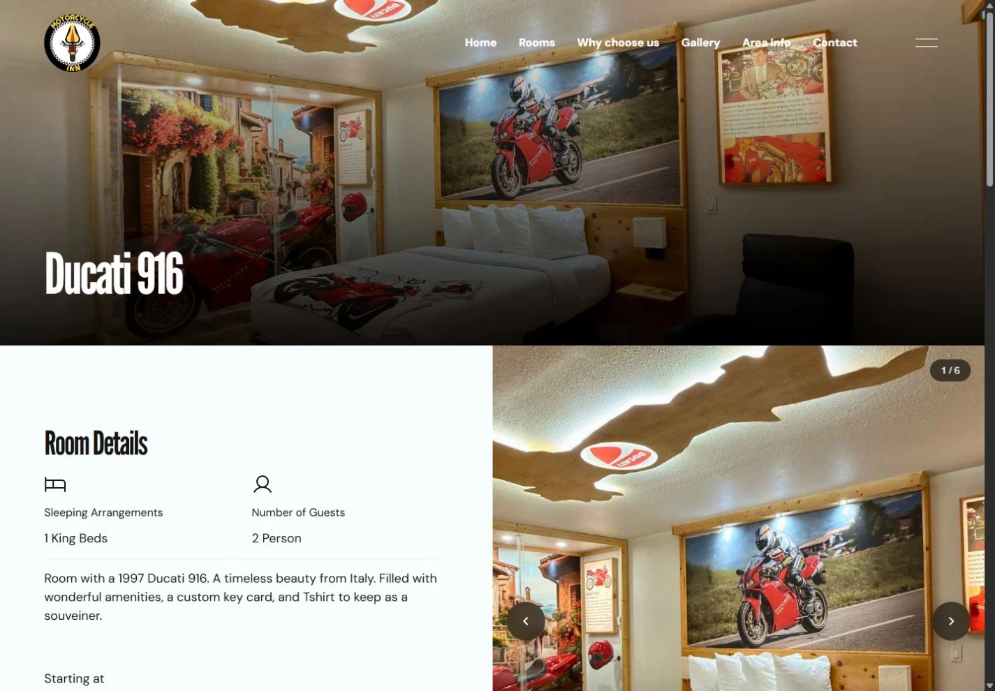
A room collection leads into individual motorcycle themes, galleries and stay details.
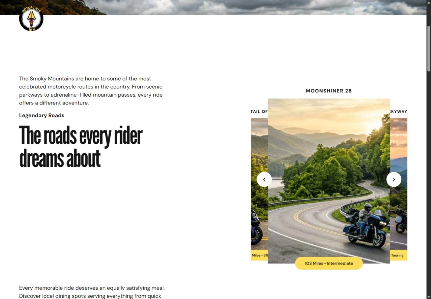
Area information makes the roads and local experience part of the journey.
The room detail pages connect the motorcycle theme with useful information: sleeping arrangements, photographs and an availability link. The Area Info section broadens the experience with visual route cards and local discoveries. Together, these views let visitors move from the atmosphere of the inn to the specifics of their trip without losing the brand’s character.
Biker Bee adds a friendly face to the visual language. The leather jacket, sunglasses and yellow-and-black palette anchor the rider character. The mountain-overlook artwork gives the character a place in the wider landscape, while a maintenance variation changes the outfit and tools for service communications. Illustrated and dimensional treatments keep that personality recognisable across different uses.


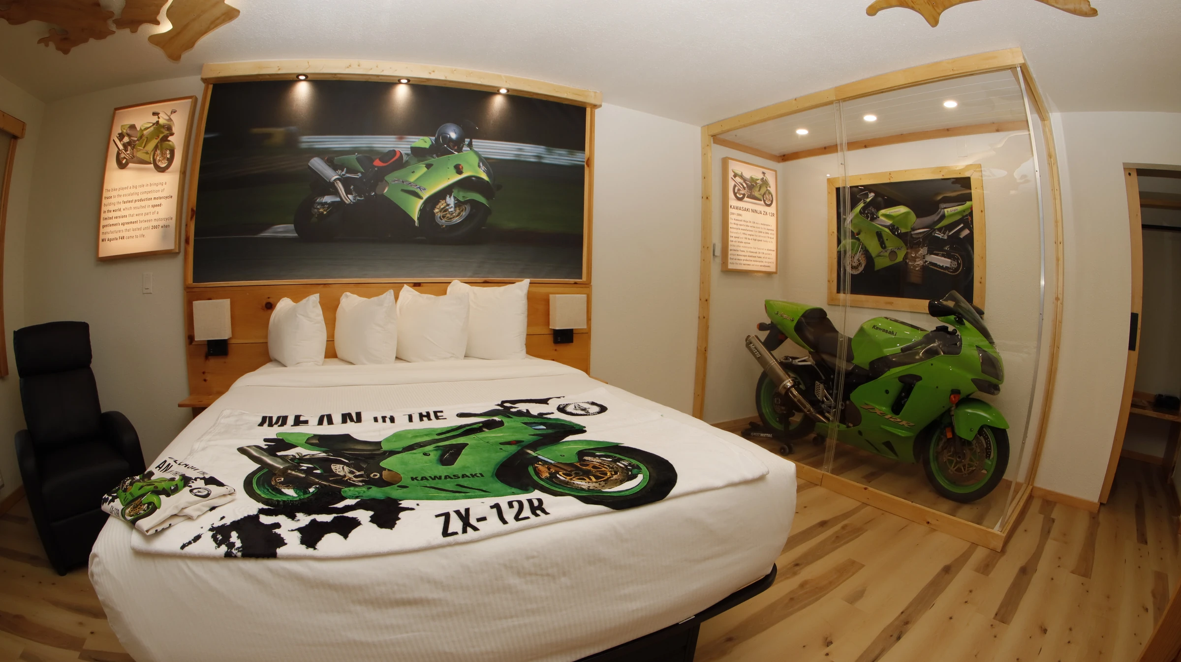
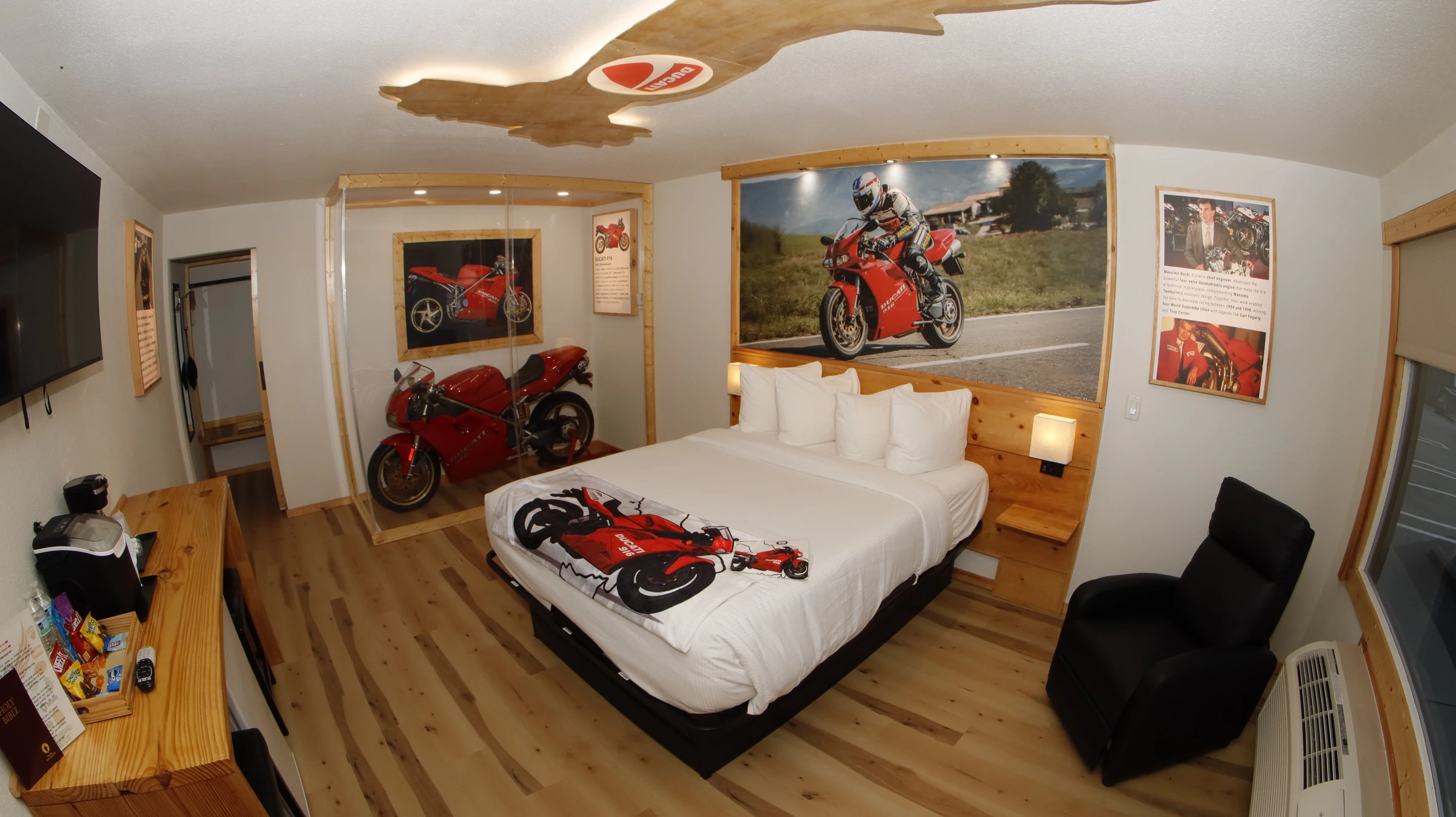
The motorcycle theme carries into the guest rooms through artwork, colour and room-specific details. The Kawasaki and Ducati rooms show how each machine gives a space its own character while remaining part of the wider Motorcycle Inn identity.
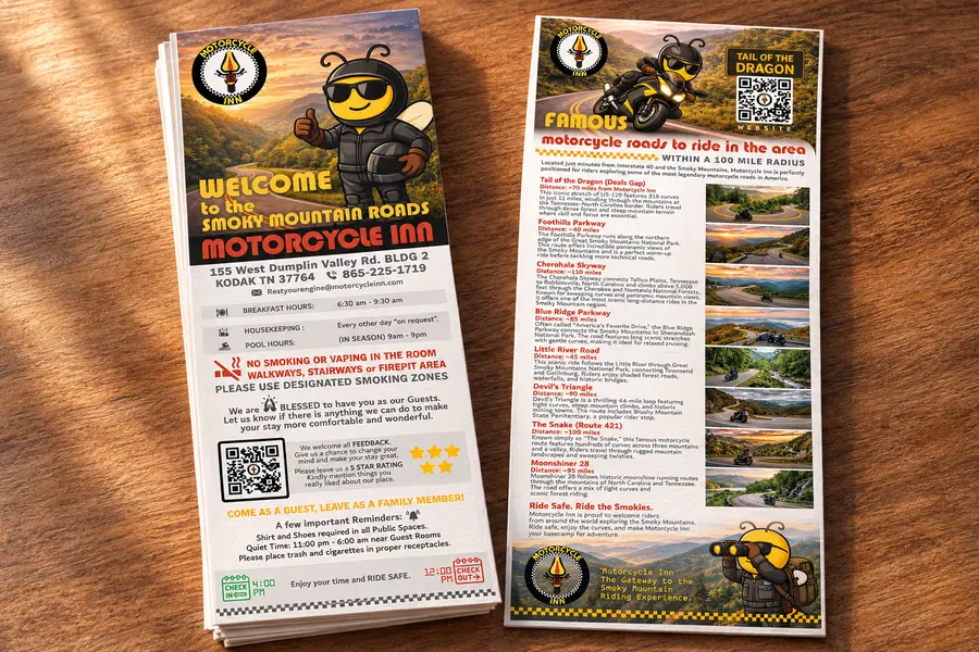
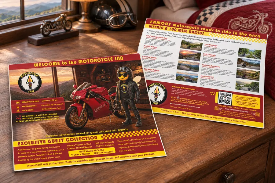
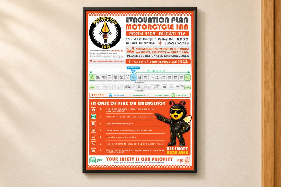
The welcome brochure introduces the inn and the roads around it. A Ducati 916 edition makes the information specific to its room, connecting the motorcycle theme with the guest merchandise collection. Lobby information and an evacuation-plan layout extend the same visual language into practical communication. Bold headings, illustrated characters and checkered details connect the pieces while giving each its own purpose.

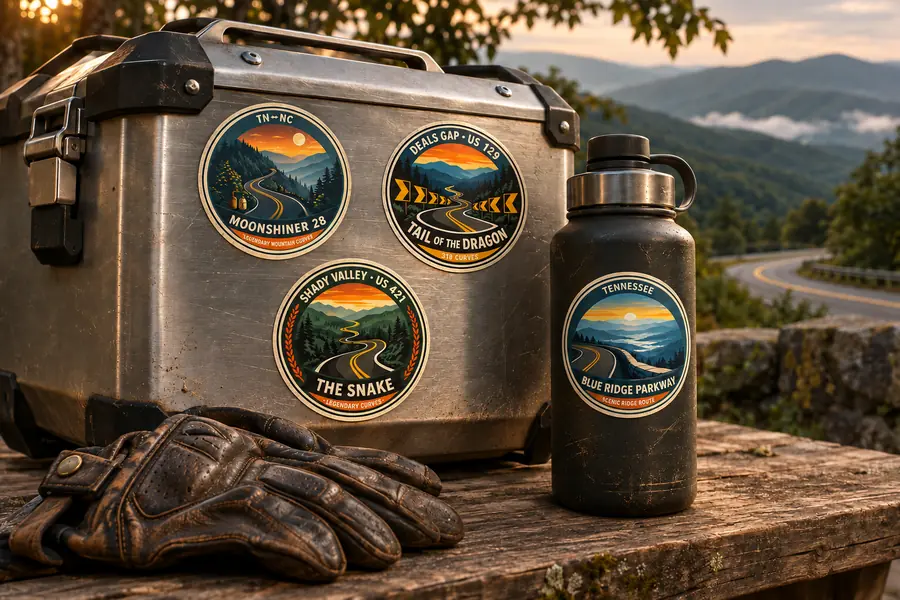
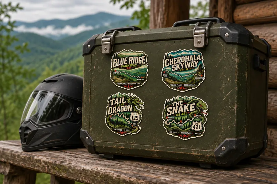
Room-specific T-shirt graphics and curated route stickers extend the experience beyond checkout. The circular badge collection was the selected direction from the first sticker set. A second collection adds expressive lettering, route maps and mountain illustrations. Here, selected designs are presented on riding gear as visualization mockups, suggesting how the collection can travel with a rider.


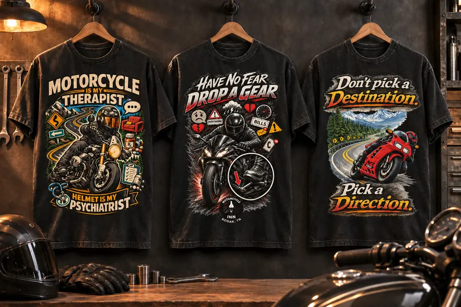
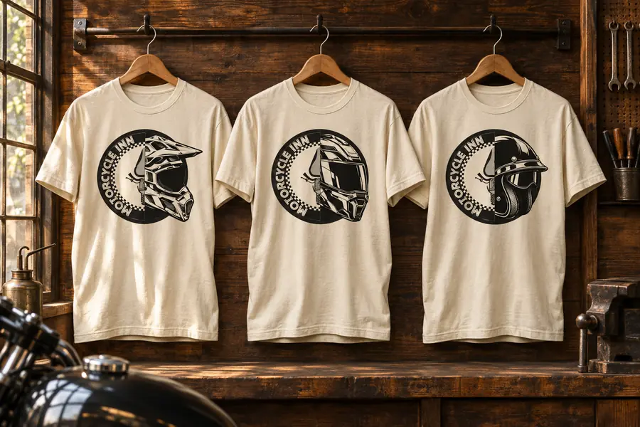
Three illustrated designs bring different sides of riding into the merchandise collection: Motorcycle Therapist, Drop a Gear and Pick a Direction. Each combines a strong headline with a detailed motorcycle scene. The helmet-and-logo series takes a quieter approach, pairing the inn’s circular identity with different helmet silhouettes in a single-colour print. The T-shirt collection brings the character of each design into a wearable format.
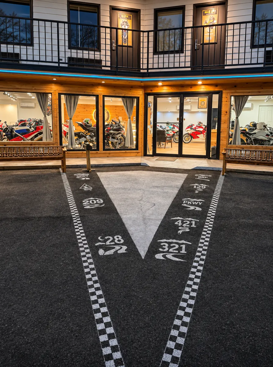
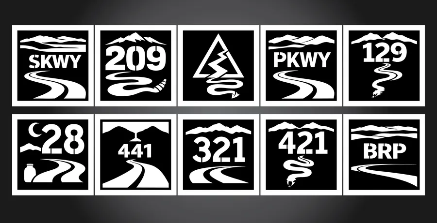
Designed to be spray-painted at the entrance, these stencils bring the surrounding riding routes onto the ground beneath guests’ feet. Route numbers, mountain silhouettes and winding-road motifs form a compact monochrome system. White paint stands out against the asphalt, while checkered borders carry the motorcycle theme along the approach to the doors.
The Sprinter wrap layout brings the same ingredients onto a moving canvas: the identity, Biker Bee and motorcycle imagery. Seen alongside the website, guest print and merchandise, it shows the breadth of the system. The result is a connected body of design work that makes the inn recognisable before arrival, throughout the stay and beyond it.

A culture of curiosity, drawn into the workspace.