
Wesmarc
Logo, visual identity, product catalogue, and website design for Wesmarc Doors.
- Logo exploration
- Colour & typography
- Product catalogue
- Website design
From an opening gesture to a complete door-brand system.
- Type
- Professional work · at Idiom
- Design contribution
- Vasav
- Scope
- Logo · Identity · Catalogue · Website design
- Studio
- Idiom Design and Consulting
A brand at two scales
A door is both an architectural element and a product with specific materials, dimensions and hardware. Wesmarc’s identity and communication work at both scales: the first impression of a room, and the detail needed to understand a product. Logo, catalogue and website share a consistent visual hierarchy.
Finding the mark in the product
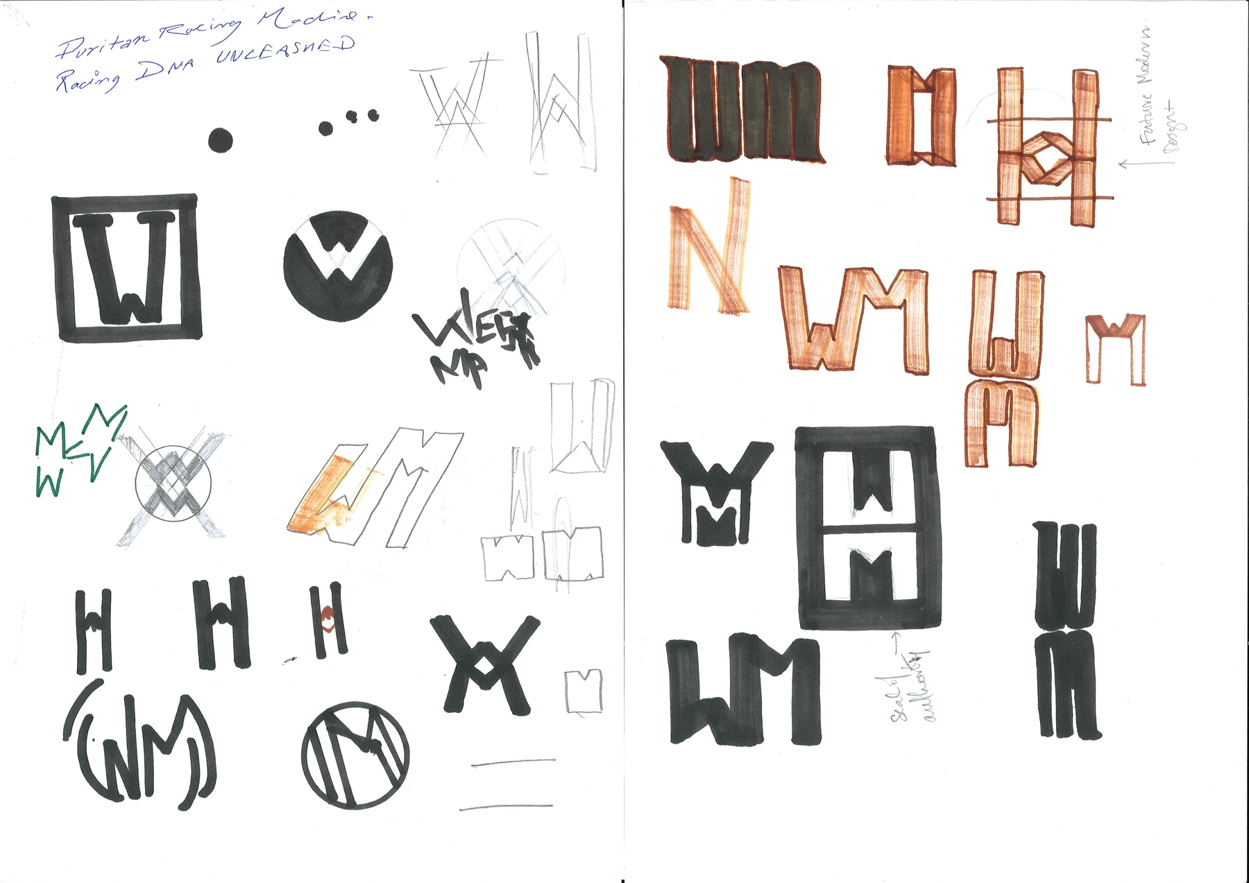
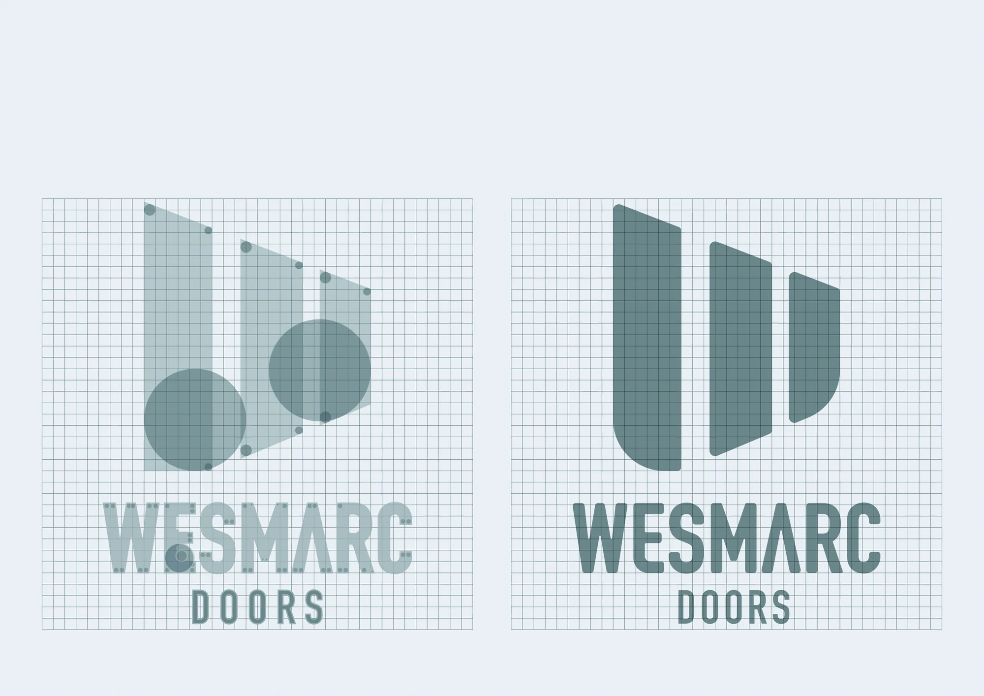
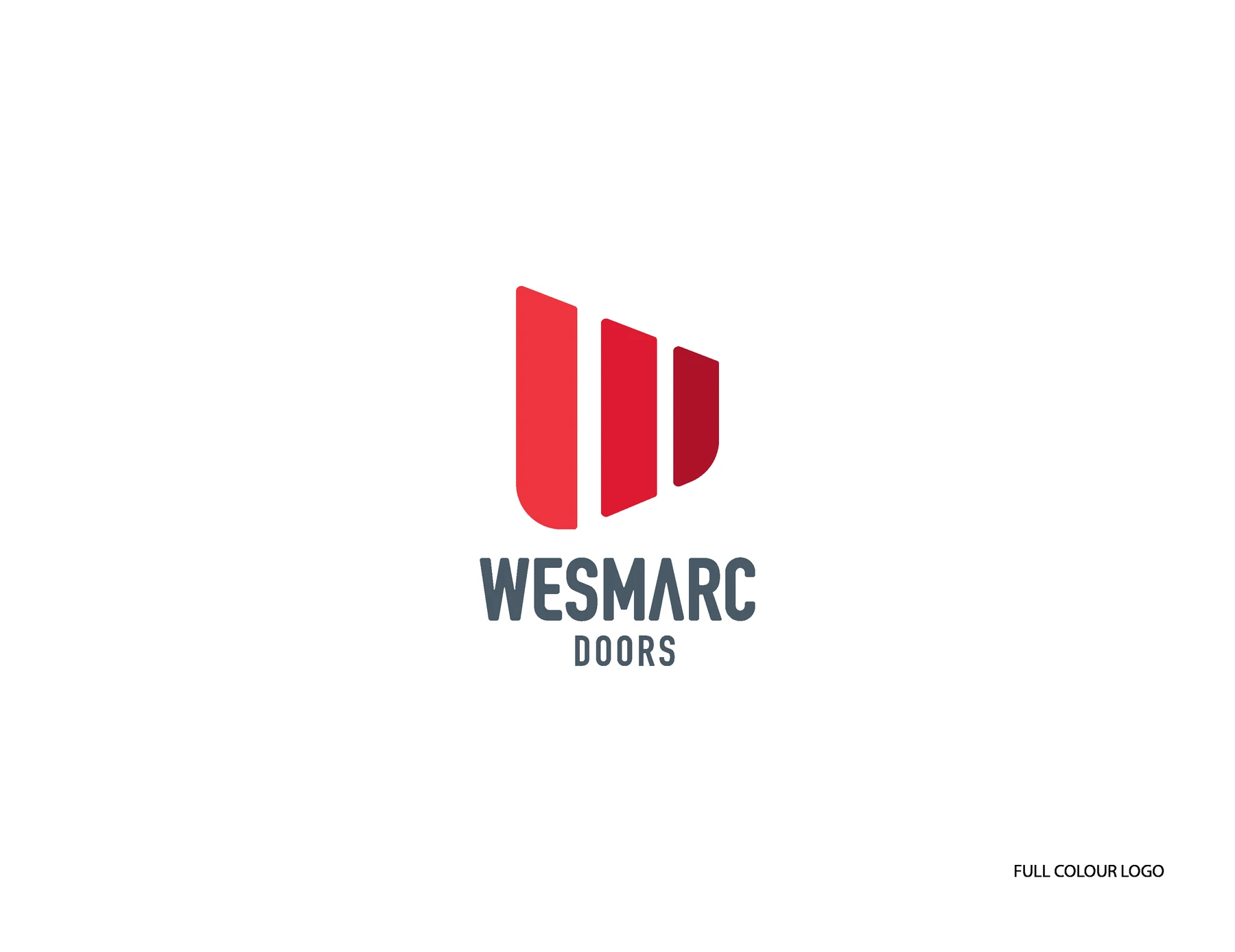
The early studies explore letterforms, repeated verticals and door-like planes. Construction studies narrow those ideas into a compact symbol. The resolved mark uses three upright forms to suggest an opening; the red field gives it a clear presence beside the condensed wordmark.
A practical visual vocabulary
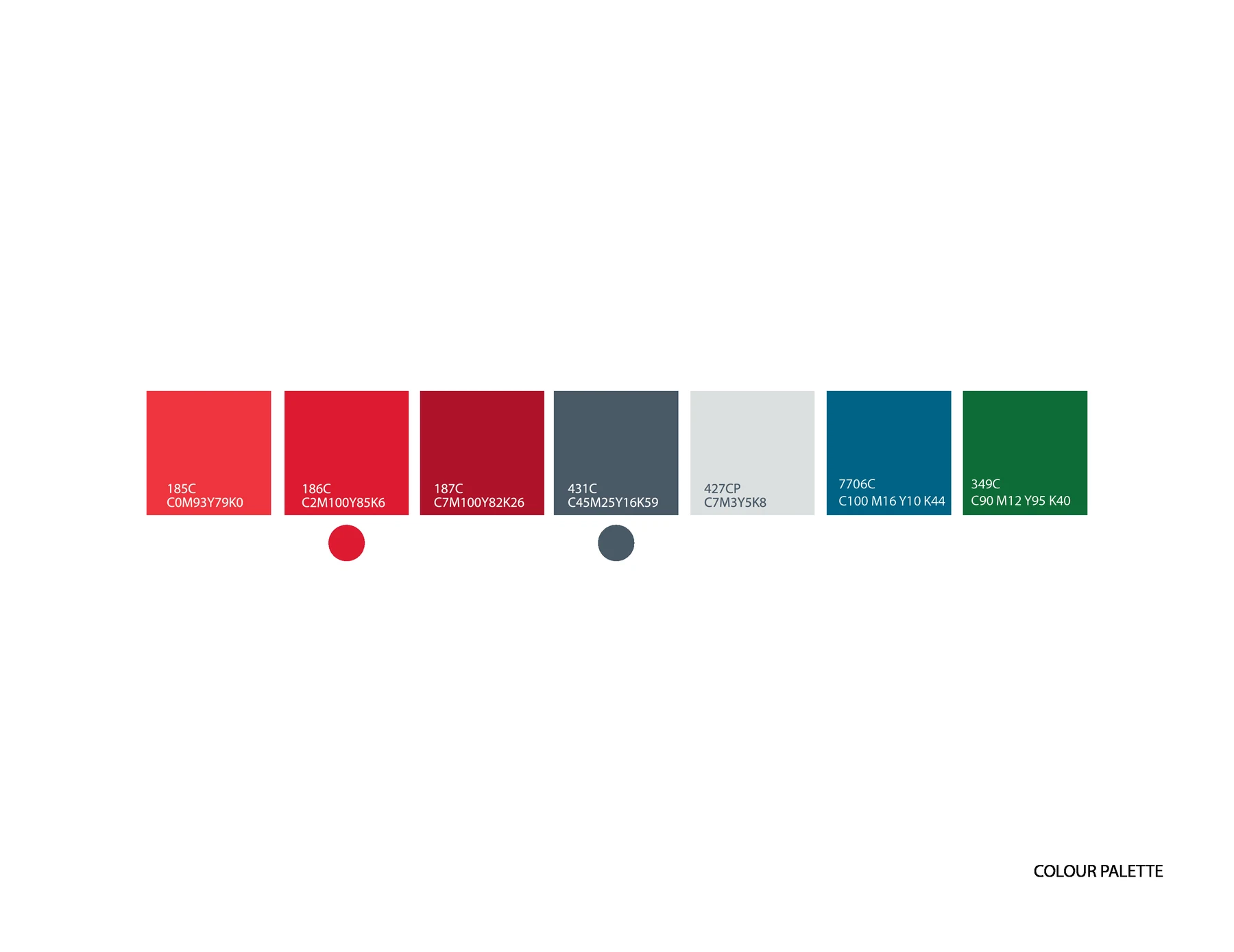
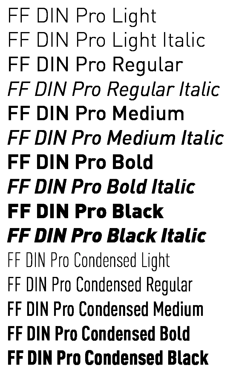
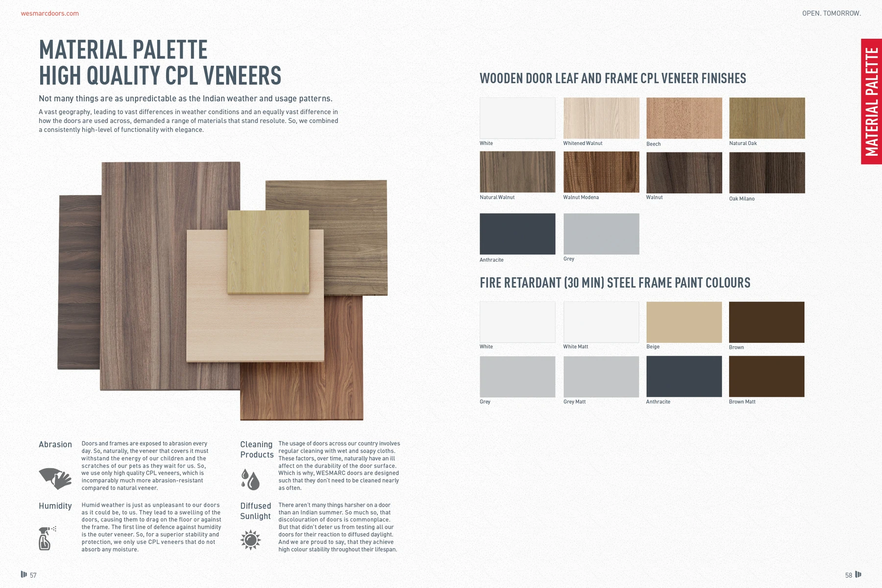
Red acts as the brand’s strongest signal. Slate and neutrals support product photographs and information without competing with them. The type specimens introduce a range of weights and widths, giving catalogue headings, labels and specifications distinct but related voices.
Inspiration first. Detail close behind.
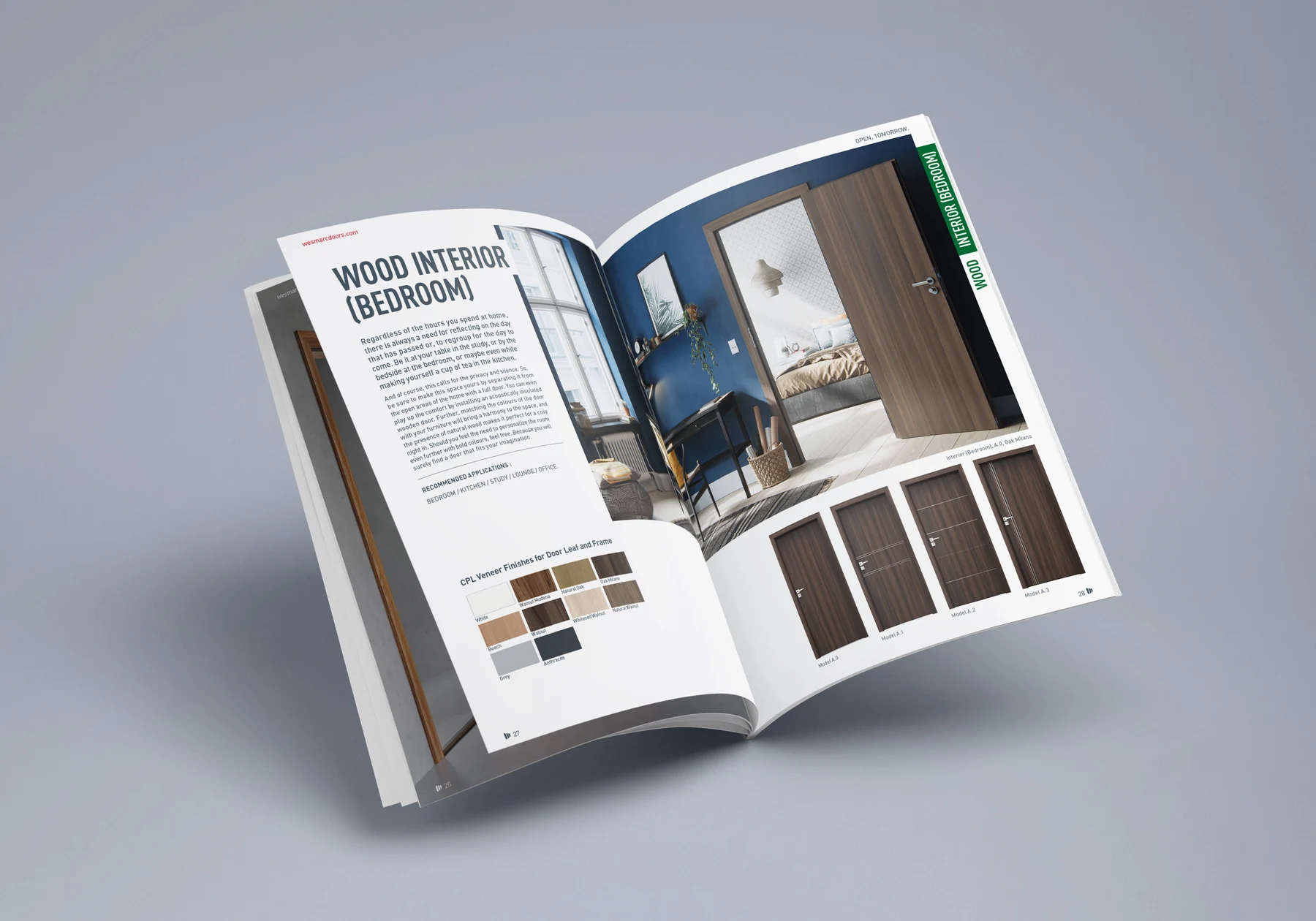
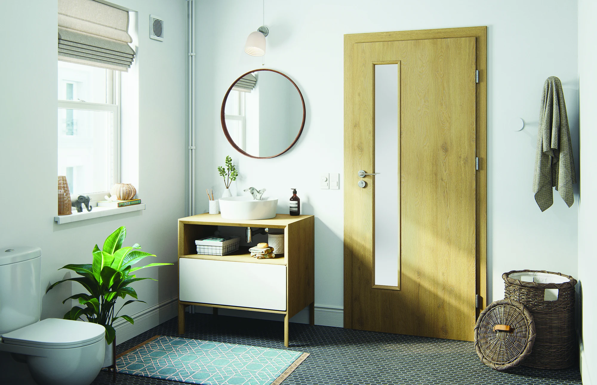
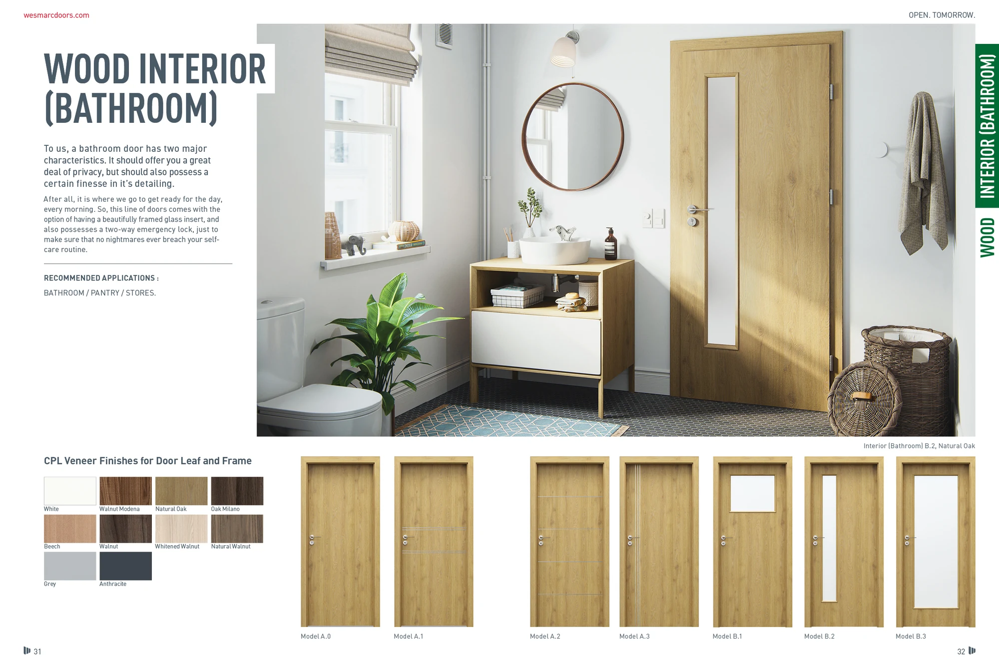
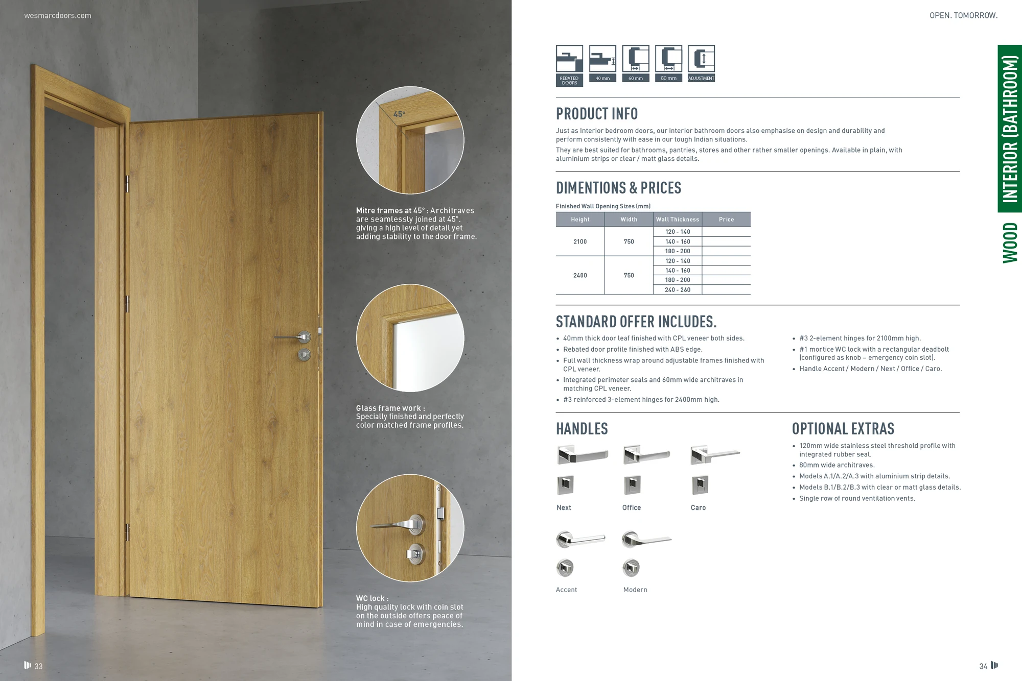
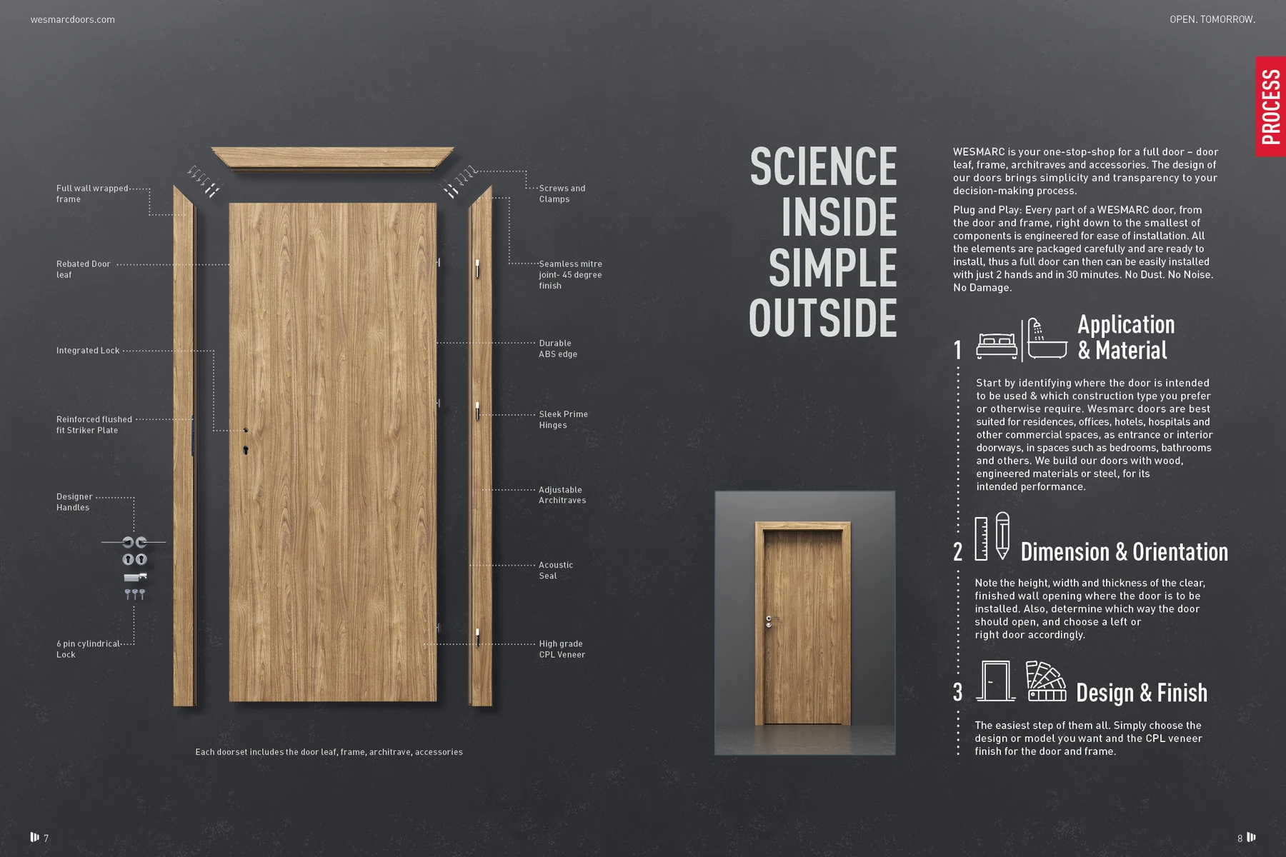
The catalogue alternates an inviting room view with the information required to compare a door. Finish options, construction diagrams and hardware details sit within a consistent page structure. The paired bathroom spreads show that shift particularly clearly: a product in context, followed by a closer technical reading.
The same system, organised for a screen
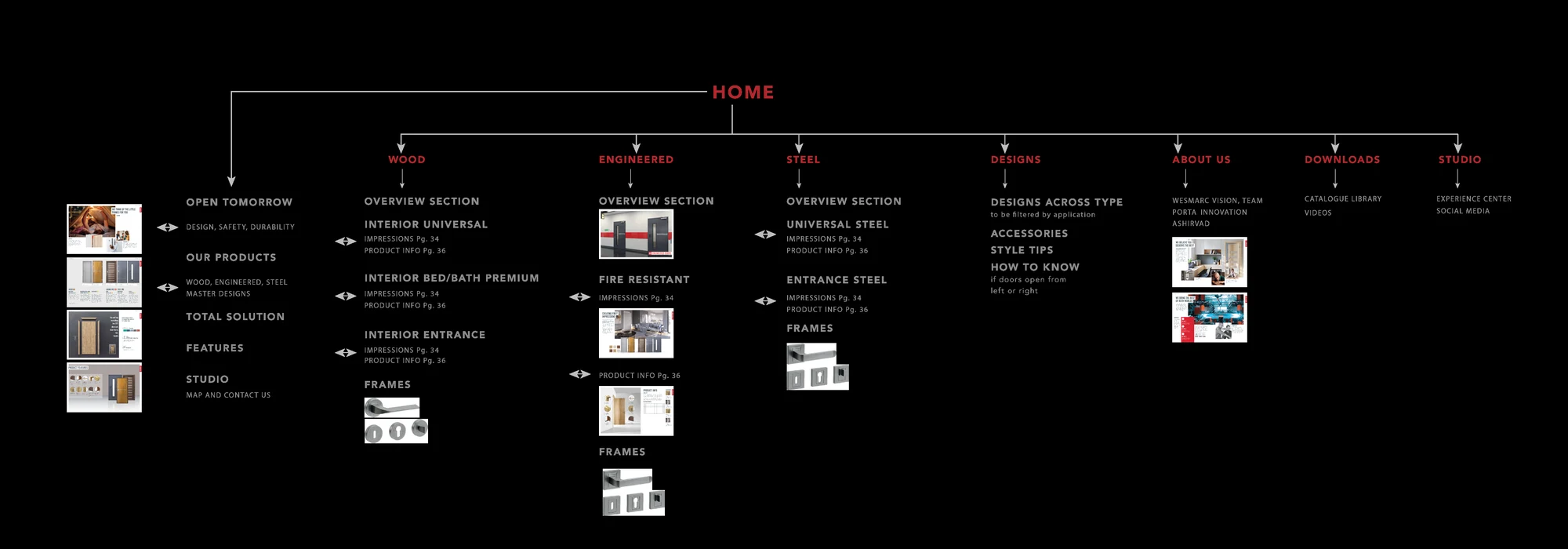
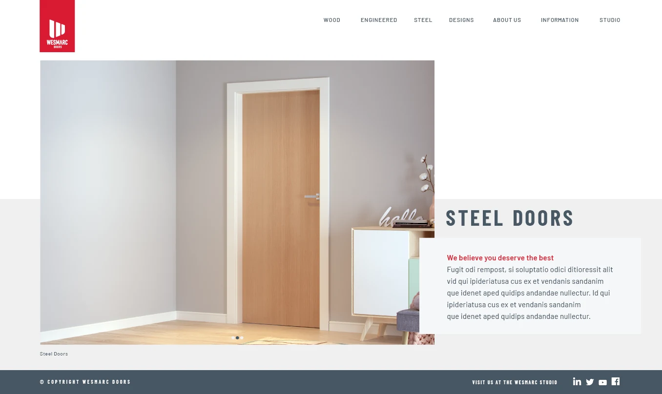
Website planning connects the brand story to product categories and supporting information. The sitemap makes that structure visible before the product-page design gives it a visual form. Large imagery establishes context, then headings and feature groups bring the visitor closer to the product. These are website design studies.
LivQuik
A fintech identity built to move across touchpoints.